RESEARCH
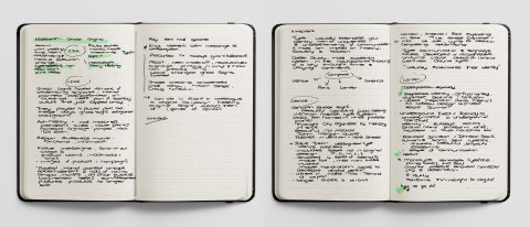
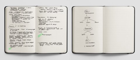
Sketchbook research, analysis ideas for Week 1.
Ghost signs are the faded remains of advertising signage and hand-painted adverts, scrawled onto buildings that were a part of an everyday culture that has slipped away (Foyle, 2019). Paula Scher's statement 'words have meaning, but the type has spirit' (Tolley, 2021) is all the more ominous in this context. With the fast-paced evolution of advertising and technology, will designers, who now play such a pivotal role, become redundant like the typesetters and hand-painting artisans of old?

Fig. 1: Sam Roberts, Financial Times, 2021.
Ghost signs, fading ads or wall markings have a story-telling quality about them. They are fragmented letters and sun-bleached pictures of products that no longer exist (Bruch, 2018).
Although most commonly associated with the start of the industrial revolution, ghost signs date back to the wall art of prehistoric times and commercial signage found in both Pompei and Herculaneum. From 1890 to 1960, artisan hand-painters painstakingly created artwork onto the walls of towns, shops, houses and old office buildings as a cheap form of advertising (Ghost Signs, 2021). What began as the simple, informative communication of a business name evolved to messaging, slogans, claims, wordmarks and logos. Eventually, large-scale images of products and campaigns began to adorn towns' walls. The signage practices during this time were a precursor to today's giant billboards.
New materials in the 1950s revolutionized signage. Vinyl, colour printing and specific fonts created a changing world where ghost signs faded into the background (Tolley, 2021).
I applaud those today trying to create awareness of our shared history through these ghost signs.
Matt Cohen – Hiding in Plain Sight: Uncovering History through Ghost Signs – TEDx Winnipeg (Stephen Dubienski, 2015).
William Stage – Ghost Signs: Brick Wall Signs in America (Foyle, 2019).
Craig Winslow – Digital Reanimation Exhibition (Beaudette, 2017).
In the modern world, digital advertising is fleeting. We are exposed to an estimated 4000 adverts a day, yet none of them leaves a lasting impression. Ghost signs' nostalgia gives me hope that societies desire for authenticity, craft and memorable messaging will never render the design profession obsolete.
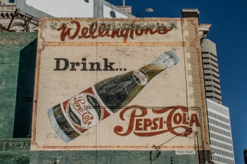
Fig. 2: The Exchange District Biz, 2016.
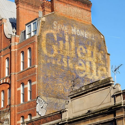
Fig. 3: Hand Craft Creative, 2021.
ANALYSIS
Typography in an urban space reflects the unique character of space and people who live there. Typography is a visual externalisation of a location's identity with uniqueness and understanding of communication (Tolley, 2021).
Typography in cities dresses up everything from storefronts and street signs to train stations and office buildings. Typography contributes to shaping a city's identities as much as urban infrastructure and architecture do. If Architecture and buildings reflect how people live and use a space, then typography detects a place's character, invoking history, reflecting changing trends and influencing peoples' behaviour (Sugita, 2019).
You know you are in a foreign land when you exit an airport and head downtown, noticing the sings, storefronts, and advertisements that are not familiar (Sugita, 2019). Universally recognisable are the iconic Helvetica letters in a New York subway station, the red, blue and white Roundel in the London Underground and the Venice Water Taxi Terminal's beautiful stencilling.
Venetian street signs boast the most beautiful stencil lettering using the Nizioletti type system. The black text framed in a white plaster panel and arranged by the hierarchy in size compliments the city's beauty and romance. It does, however, lack practicality and functionality that should work hand in hand with design.
With London and America exploding in size in the 19th century, street signage, information and competitive advertisings were chaotic. America's New York subway was a labyrinth of mismatched signage and overlapping communication styles with not structure or logic (Martin, 2021). London's conflicting, duplicate signage and conglomeration of visual styles in advertising resulted in a confusing user experience (Damon, 2016). Cities needed to develop a recognisable, unifying visual identity, communicated through the use of typography.

Fig. 4: BBC News, 2016.
London's The Underground Electric Railway Companies identity is comprised of two parts. An iconic bullseye red disk with a station name printed in white on a blue horizontal bar and a Humanist Sans Serif typeface created by Edward Johnston known as Johnston Sans. The typography's Roman capital letters were rooted in history and traditional calligraphy, creating elegance and simplicity that fitted the modern age. It was confident and reassuring with clear communication, readability, beauty and clarity (Damon, 2016).
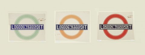
Fig. 5: BBC News, 2016.
Harry Beck in 1933 expanded on the identity, communication and functionality with an underground map. It was revolutionary in its navigation, stylised diagram, disregard of geography and scale favouring connection, colour coding and engineering. It was both practical and straightforward (Baines, 2003).
Massimo Vignelli and Unimark in 1970 reimagined the New Your Subway signage. They created the modernised wayfinding system, The New York City Transit Authority Graphics Standards Manual, outlining the use of all signage, materials and lettering. It was beautiful, modern, detailed, legible, easy to navigate, logical and straightforward (Hustwit, Gary, 2015). Design and clear communication worked in harmony to create the best possible result (Martin, 2021).
After that, Gary Hustwit created the New York subway map clear in its simplicity. It effectively helped people navigate a complicated infrastructure by giving them the right amount of information when they needed it (Monotype. 2021).
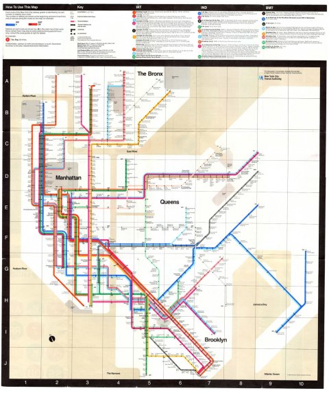
Fig. 6: Ceros, 2021.
Smart identities are not stationary but ever-evolving to keep with the times, influenced by changing lifestyles and trends and a new digital world.
Jake Tilson developed a digital version of the Venician typeface known as Venice Nizioleto. He amalgamated four sets of stencils and hand-drawn replications, including letters not in the original type, larger sizes and glyphs. The font is now used in the Water Taxi Terminal at the Venice Airport (Tilson, 2017). Monotype remastered the Johnston typeface for the London Underground by bringing back the typeface's soul that had been lost in replications since its creation. The quirks were kept and a thin weight created for digital purposes (Monotype. 2021).

Fig. 7: Jake Tilson Studio, 2017.
Typography defines a city's character and visual identity, contributing to the city's graphic language (Introducing Johnston100, the language of London., 2021).
WORKSHOP CHALLENGE
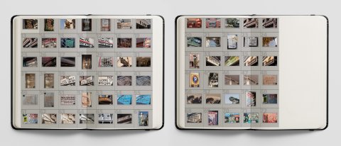
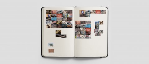
Sketchbook Workshop Challenge ideas for Week 1.
CAPE TOWN
Cape Town is a melting pot of people in a city with a rich, diverse cultural heritage and character. Typography in the mother city reflects a history of human experience, unique character of space and culture.
Communities have lived in the Cape, from the San, Khoikhoi to many African tribes, Dutch colonisers, French Huguenots, British colonials, Germanic and Irish immigrants, and the Cape Malay. The Malay was made up of slaves from India, Sri Lanka, Malaysia, and Indonesian are but a few (DISCOVER CAPE TOWN'S RICH CULTURAL HERITAGE, n.d.).
Cape Town and its inhabitants bring a diverse cultural experience to the look and feel of the city. A Eurocentric influence lives alongside extensive scale industrialisation and modern cityscapes (SatRenovationFrontend, 2021). Inequality and gentrification are evident in the distinction of poverty and wealth that today live alongside one another due to the apartheid rule of displacement and racial segregation.
Architecture and cultural heritage were lost as a result of apartheid displacements, racial segregation and gentrification. Inequality is evident today in the rich neighbouring the poor, yet the buildings, materials, typography and it's execution add to instead of detracting from the city's personality.
What is evident throughout is the rich African heritage of bold, vibrant colours, craft, innovation and inexpensive artistry. Much is achieved with limited tools and throwaway materials—mosaics, intricate wirework, wood carvings, hand painting showcase elementary, artisanal typography.
All, over time, left their mark on the character of the city.
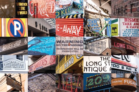
Fig. 8: Images of typography in Cape Town
THE OLD BISCUIT MILL - Albert Road, Woodstock, Cape Town, South Africa.
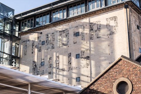
Fig. 9: THE OLD BISCUIT MILL - Albert Road, Woodstock, Cape Town, South Africa.
The ghost sign typography is on a wall of The Old Biscuit Mill in Woodstock, Cape Town. Built-in the Industrial revolution of the 1900s by John Pyott (the old biscuit mill, 2021), the company name and messaging were hand-painted by an artisan of the time as a means of cheap advertising and identification. A clean, bold, minimalistic and straightforward Neo-Grotesque typeface similar to that of Helvetica and Univers was used (A History of Typeface Styles & Type Classification, 2021).
Before Covid, the building housed the infamous Pot Luck Club whose signage hung in a complementary manner alongside the ghost signage and played off its Cape Town heritage.
AFRICAN KIOSK - Church Street & Long Street, Cape Town City Centre, Cape Town, South Africa.

Fig. 10: AFRICAN KIOSK - Church Street & Long Street, Cape Town City Centre, Cape Town, South Africa.
Long Street is one of Cape Town’s most improbable and exciting streets and a jumble of seeming contradictions where prim Victorian architecture sits alongside cheap kiosks and African start-ups (Cape Town’s Iconic Long Street, 2021). An African kiosk is advertised in a bold, vibrant, colourful manner using Helvetica for clear communication. The mid-weighted font is striking and simplistic. It says what it is in an uncomplicated way. These businesses have limited funds, and the use of corrugated, container material is commonplace due to cost and security. The typography would have been stencilled onto the red container using inexpensive paint.
MONUMENT OUTSIDE THE LONG STREET BATHS - Long Street, Gardens, Cape Town, South Africa, 8001.
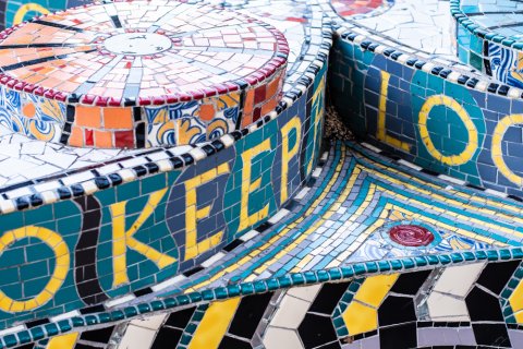
Fig. 11: MONUMENT OUTSIDE THE LONG STREET BATHS - Long Street, Gardens, Cape Town, South Africa, 8001.
Long Street forms a rich backbone to the inner city and is a microcosm of South Africa’s thrilling multi-culturism. Dating back to 1908 with more than three centuries of history, beautiful architecture and diverse offerings to both night owls and daytime visitors gives it an appeal and attraction like few other places in Cape Town (Cape Town’s Iconic Long Street, 2021). A small monument pays homage to a rich cultural heritage outside the Long Street Baths, a Roman-style heritage site. The monuments colourful mosaic-style typography was created by disadvantaged communities and reflects the traditional, artisan work of African. The bright yellow Geometric, Futura type, is clean, legible, and straightforward alongside the design's intricate patterning and colours, allowing for clear communication.
WOODSTOCK CARPENTRY - Albert Road, Woodstock, Cape Town, South Africa.
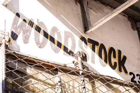
Fig. 12: WOODSTOCK CARPENTRY - Albert Road, Woodstock, Cape Town, South Africa.
Woodstock is one of Cape Town’s oldest suburbs, established in 1788. It initially housed farm cottages and fisherman houses until a new urbanisation era, where working-class residents were ushered in during the 19th century. The area is undergoing gentrification, but most derelict buildings function as low-income businesses for those displaced by apartheid-era segregation. A faded, hand-painted sign, created in the mid-1950s announces the company and location in a friendly manner. The san serif typeface has a colourful, decorative drop shadow which adds a Cape Malay personality to the business. Residents would see this as a trustworthy, affordable family business.
DO NOT PARK SIGN - 157 Long Street, Cape Town City Centre, Cape Town

Fig. 13: DO NOT PARK SIGN - 157 Long Street, Cape Town City Centre, Cape Town.
Cape Town's heart is a rich, bold, vibrant expression of culture through colour. The South African road signs are based on the SADC-RTSM, a strict, well-executed and easily navigated system. If you look at African fashion, painted houses, beaded jewellery and art it makes sense the an over the top flair for colour would also be seen in our road signs. The fonts are bold, san serif, geometric fonts that allow for clear communication with striking colours for noticeability.
REFELCTIONS
This week allowed me to explore the exceptional cultural heritage of Cape Town with my camera in hand. It helped me tell a story of the history, lifestyles, and people of the mother city in many ways.
Cape Town is a rich and culturally diverse city with wealth and poverty apparent in everyday life. Walking the streets and admiring African artists' artisanal craft, gave me an appreciation for the more impoverished communities and how they make do and thrive with very little. There is a sense of joy, enthusiasm positivity and happiness that these communities exude.
In Woodstock, I was given a guided tour by someone who slept on the street of the art and graffiti adorning the dilapidated building walls. He knew each artist by name and could elaborate on their work in intricate detail. I lost count of the beggars who asked me to take their photograph and children who wanted to pose alongside neighbourhood signage.
Cape Town's identity is one of heart and enthusiasm, together with a wealth of diverse styles, architecture, typography materials and sights. I feel like I unearthed the exuberance my city has to offer inadvertently through its typography.
Reference: Foyle, J., 2019. Ghost signs: a look at advertising's fading messages. [online] Ft.com. Available at: <https://www.ft.com/content/1cf2205a-7e35-11e9-8b5c-33d0560f039c> [Accessed 28 January 2021].
Reference: Tolley, S; Lecture Presentation, Module GDE720, History and Futures. [Accessed 28 January 2021].
Reference: Bruch, T., 2018. Winnipeg's ghost signs tell the story of a different era. [online] Global News. Available at: <https://globalnews.ca/news/4032936/winnipegs-ghost-signs-tell-the-story-of-a-different-era/> [Accessed 28 January 2021].
Reference: Winnipeg Architecture Foundation. 2021. Ghost Signs. [online] Available at: <https://www.winnipegarchitecture.ca/ghost-signs/> [Accessed 28 January 2021].
Reference: Beaudette, T., 2017. Winnipeg's ghost signs of being reanimated by American artist | CBC News. [online] CBC. Available at: <https://www.cbc.ca/news/canada/manitoba/exchange-district-s-ghost-signs-getting-temporary-facelift-1.4213106> [Accessed 28 January 2021].
Reference: Stephen Dubienski, 2015. Matt Cohen. [podcast] Hiding in Plain Sight: Uncovering History through Ghost Signs. Available at: <https://tedxwinnipeg.ca/speaker/matt-cohen/> [Accessed 28 January 2021].
Reference: Baines, Phil (2003) Signs, Lettering and Environment (Links to an external site.), (London: Laurence King)
Reference: Hustwit, Gary (2015) 'A Rare Interview with Graphic Design Legend Massimo Vignelli (Links to an external site.)', Fast Company, 24 March [online]. (Accessed: 5 December 2018)
Reference: Sugita, M., 2019. Urban typography: a glimpse into a world of local typefaces in Japanese cities, and their survival. [online] World Architecture Community. Available at: <https://worldarchitecture.org/article-links/eczge/urban-typography-a-glimpse-into-a-world-of-local-typefaces-in-japanese-cities-and-their-survival.html> [Accessed 28 January 2021].
Reference: Martin, S., 2021. Graphic Design Legend Massimo Vignelli's NYC Subway Design. [online] Ceros Originals. Available at: <https://www.ceros.com/originals/massimo-vignelli-nyc-subway/> [Accessed 28 January 2021].
Reference: Damon, D., 2016. Johnston Sans: The Tube typeface that changed everything. [online] BBC News. Available at: <https://www.bbc.com/news/magazine-35916807> [Accessed 28 January 2021].
Reference: Monotype. 2021. Introducing Johnston100, the language of London. [online] Available at <https://www.monotype.com/resources/case-studies/introducing-johnston100-the-language-of-london> [Accessed 28 January 2021].
Reference: Go2africa.com. 2021. Cape Town’s Iconic Long Street | Go2Africa.com. [online] Available at: <https://www.go2africa.com/african-travel-blog/cape-towns-iconic-long-street> [Accessed 29 January 2021].
Reference: Love Cape Town. n.d. DISCOVER CAPE TOWN'S RICH CULTURAL HERITAGE. [online] Available at: <https://www.capetown.travel/discover-cape-towns-rich-cultural-heritage/> [Accessed 29 January 2021].
Reference: (SatRenovationFrontend, 2021)
Your Bibliography: Southafrica.net. 2021. SatRenovationFrontend. [online] Available at: <https://www.southafrica.net/zm/en/travel/article/cape-town-s-history-is-a-story-you-need-to-know> [Accessed 29 January 2021].
Reference: Google.com. 2021. the old biscuit mill - Google Search. [online] Available at: <https://www.google.com/search?client=safari&rls=en&sxsrf=ALeKk01j_GsHgYj50LpI4-UC6Izn9Yk3OQ%3A1611948399538&ei=b2EUYLmRIOKN1fAP27-jkAc&q=the+old+biscuit+mill&oq=the+old+biscuit+mill&gs_lcp=CgZwc3ktYWIQAzIECCMQJzIECCMQJzIECCMQJzIICC4QxwEQrwEyBQgAEMkDOg4ILhDHARCjAhCRAhCTAjoLCC4QxwEQrwEQkQI6BAgAEEM6CAgAELEDEIMBOgIILjoICC4QsQMQgwE6BQguEJECOgoIABCxAxCDARBDOg0ILhDHARCvARAUEIcCOgUILhCxAzoCCABQktVhWILnYWCw6WFoAHABeACAAfIDiAHYLZIBBzItNS45LjOYAQCgAQGqAQdnd3Mtd2l6wAEB&sclient=psy-ab&ved=0ahUKEwj5hIDe78HuAhXiRhUIHdvfCHIQ4dUDCAw&uact=5> [Accessed 29 January 2021].
Reference: Spoon Graphics. 2021. A History of Typeface Styles & Type Classification. [online] Available at: <https://blog.spoongraphics.co.uk/articles/a-history-of-typeface-styles-type-classification> [Accessed 29 January 2021].
Image 1: Financial Times, 2021. Ghost signs: a look at advertising's fading messages. [image] Available at: <https://www.ft.com/content/1cf2205a-7e35-11e9-8b5c-33d0560f039c> [Accessed 28 January 2021].
Image 2: The Exchange District Biz, 2016. Ghost Sign Walking tour. [image] Available at: <https://exchangedistrict.org/event/ghost-sign-walking-tour-3/2016-07-10/> [Accessed 28 January 2021].
Image 3: Hand Craft Creative, 2021. Writing on the Wall. [image] Available at: <https://handcraftcreative.com/writing-on-the-wall> [Accessed 28 January 2021].
Image 4, 5: BBC NEWS, 2016. Johnston Sans: The Tube typeface that changed everything. [image] Available at: [Accessed 28 January 2021].> [Accessed 28 January 2021].
Image 6: Ceros, 2021. How Graphic Design Legend Massimo Vignelli Cracked the NYC Subway System. [image] Available at: [Accessed 28 January 2021].> [Accessed 28 January 2021].
Image 7: Tilson, J., 2017. Jake Tilson/ Font / Venice Nizioleto. [online] Jaketilson.com. Available at: <https://www.jaketilson.com/fonts/venicenizioleto/index.html> [Accessed 28 January 2021].
Image 8 -13: Wiggett, S. [image] [Photographed 28 January 2021]