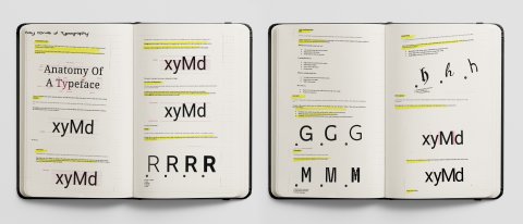
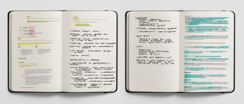
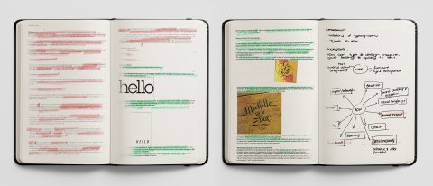
Sketchbook research, analysis and idea's for Week 10.
A Brief History of Typography
Throughout history, typefaces have been influenced by technological advances, culture shifts, and creativity.
Typography began with scribes who wrote out manuscripts to replicate them. This was, however, a slow, costly process that hampered the spread of knowledge as everything needed to be done by hand. In the 1400s Johannes Guttenberg gave the world a cheaper way to obtain the written word with the invention of movable typefaces and the typeface blackletter. A dark, practical, intense but not very legible typeface.
In 1470, Nicolas Jenson, inspired by ancient Roman buildings, created Roman Type. More legible than blackletter, this quickly spread across Europe. In an attempt to save money on printing and fit more words onto a page, Aldus Manutius created italics in 1501. Today, italics are used for emphasis when writing. Willaim Caslon created 'old style', which featured straighter serifs and more contrasts between thin and bold strokes in 1734.
John Baskerville created a Roman-style type, Transitional, with very sharp serifs and lots of drastic contrast between thick and thin lines in 1757. The distinction became more extreme with Firmin Didot and Giambattista Bondoni creating the first modern Roman typefaces Didot and Bodoni in 1780. Vincent Figgins started Egyptian or Slab Serifs, a squared or boxed serif in 1815.
The start of San Serif typefaces was a result of William Caslon IV creating the first typeface without any serifs in 1815. It was rebuked at the time but later exploded, and many variations were designed to accommodate the second industrial revolutions need for advertising. Frederic Goudy, the world's first type designer, developed numerous ground-breaking typefaces, such as Copperplate Gothic, Kennerly, and Goudy Old Style in the 1920s. Paul Reneer followed with Futura and Geometric Sans in 1927, from which Eric Gill created Gill Sans with softer, more natural curves. A return to minimalism during 1957 resulted in Max Miedinger creating the much loved, Helvetica typeface.
With the invention of the computer came some bad pixel fonts due to limited screen technology, which would advance at an exponential rate, and together with the internet, we now have a wide variety of old and new typefaces available for us to peruse and use. Suddenly anyone could create and distribute typefaces, which gives us an abundance of options and looks for designs. We are also, not limiting us to one or two typefaces like we would have been a few hundred years ago (A brief history of typography and typefaces, n.d.).
A Brief History of Printing
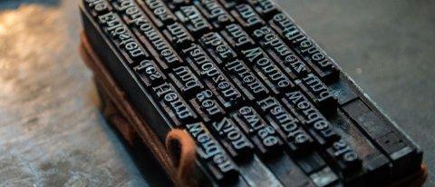
Fig. 1: Dover Press, 2020.
In 593, China printed the first character on carved wood. The Buddhist monks would evolve this to print on silk and paper rags in 868. Scribes would follow by writing out the written word, specifically in religious texts which was a long, costly process. Johannes Gutenberg invented movable type in the 1400s.
Alois Senfelder introduced lithography or flat printing on limestone plates in 1796. Photolithography came about in 1867 thanks to Tessie du Montay. Phototype setting allowed for an entire font to exist on a single object through which light was blasted and exposed onto paper, allowing for type scaling. Karl Klietsch introduced the first cylinder machine to cast an entire line of copy at one time in 1878, and George Meisenbach in 1881 presented autotopia photographic process impressions (Brief history of printing, 2010). Lithography came about in 1904, but the machines were costly, and as a result, a more affordable and readily available technique of Dry Transfer Sheets evolved. (A brief history of typography and typefaces, n.d.).
Speed and affordability came about thanks to digital printing. Technology is advancing so quickly that there seems to be no end to the ingenuity, affordability and speed of printing today.
A Brief Outline of Typography Basics
Typeface: A collection of letters, selected for their Style, legibility and readability, most effective when following principles of typographic design.
Baseline: The invisible line upon which a line of the text rests.
Cap Height: The height of a typeface's flat capital letters measured from the baseline. Round and pointed capital letters are optically adjusted by being drawn with a slight overshoot above the cap-height.
X- Height: The height of the lowercase x in a typeface.
Ascenders: Upward vertical stroke found in individual lowercase letters that extend beyond the cape height or baseline.
Descenders: Downward vertical stroke below the baseline.
Weight: The thickness of a font stroke. A font typically comes in four to six weights.
Serif: Typeface classification by a small projection that appears at the beginning or end of the stroke on a letter. Including Old-Style, Transitional, Modern and Slab Serifs.
San Serif: A typeface without a serif. Including Grotesque, Humanist and Geometric San Serifs.
Handwriting: These typefaces are unconventional with a natural, handwritten feel, including Black letter, Script and Handwriting.
Letter-spacing: Also called tracking or kerning, refers to the constant adjustment of the space between letters and text.
Line Length: the Standard length of text.
Line-height: Also knows as leading, controls the amount of space between baselines in a block of text.
Type Alignment: Controls how the text aligns in the space it appears, including left-aligned, right-aligned and centred (Material Design, n.d.).
ANALYSIS
Analyze how typographic conventions and design can inform and inspire or giving feeling and quality to the meaning of a given text?
There is power in the written word (Charchar, 2012). Typography is everywhere, from posters, brochures, websites to shop fronts and navigational signage in a city. Typography is a tool that can turn text into an impactful visual (Carton, 2020) to convey a message.
A designers' role is to emulate the tone of text through the use of typography, to communicate a tone of voice, grab the viewer's attention, create brand recognition, personality (Carton, 2020) and express different moods, atmospheres and emotions (Hannah, 2020).
Controlling the Meaning of the Message
Typography has an influential role in taking control of the meaning of the text. Emotions and physical responses can be enhanced or manipulated through visual language.
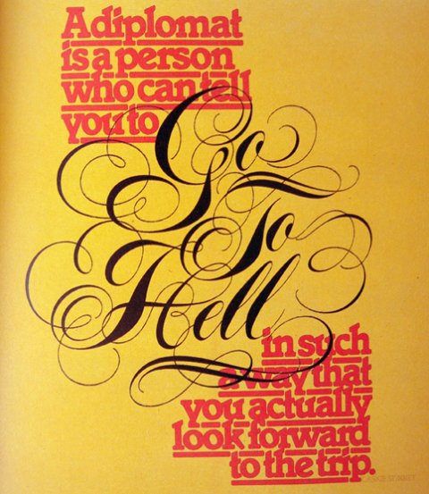
Fig. 2: Knight, 2020.
"A diplomat is a person who can tell you to go to hell in such a way that you look forward to the trip". In the same way, a politician uses his words, so too can a designer use typography to manipulate and control the meaning of a message. American designer Herb Lubalin uses US Editor Caskie Stinnett's quote in a delicate, well-considered composition of typography detailing, making an unpleasant message seem attractive. The focal point of the statement, 'go to hell', is shown in an elegant calligraphy font, enabling the offensive comment to be mistaken for something that could be looked forward to with anticipation at first sight.
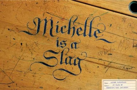
Fig. 3: Charmichael, 2010.
Allison Carmichael illustrates the power typography has to enhance or alter a message through her hand-lettering, engraved in an elaborate style onto the lid of an old school desk. At first sight, it looks like a beautiful, possibly historical, work of gothic lettering until you notice the unpleasant meaning behind the text, 'Michelle is a Slag' (Charchar, 2012).
Tone of Voice
Typography can also communicate the tone of voice, personality, age, gender and mood. It invites, comforts, incentivizes, communicates and reinforces (Gundry, 2020).

Frame 1.
Frame 1: The large, bold, closely kerned word 'hello', is positioning in the frame to make the word dominant, loud, and the message enthusiastic, friendly and confident. The word would be read aloud in a bold manner, exuding genuine delight, friendliness and openness.

Frame 2.
Frame 2: The uppercase font, scale and colour of the word 'HELLO', is positioned almost out of the frame to make the word small, suggesting a more distant, hesitant attitude. The word would be delivered in a quieter tone, almost tentative, lacking assurance and delight (Charchar, 2012).
An infinite range of typographic alternatives can achieve subtle or dramatic changes in volume and tone of voice (Hannah, 2020).
Associative and Suggestive Power of Type
The dissociative power of Type is an essential communication element. It can add historical relevance, political or period association to a design (Baines and Hasiam, n.d.). The blackletter or calligraphy type styles more commonly used in News Papers like the New York Times and Wall Street Journal have strong connotations of age, knowledge, trust and reliability, be they real and imagined. Distinctive type styles like retro, grunge and vintage set the tone of your design through visual association. A designer needs to be culturally aware of the semantic meaning and political associations of a type style and its components (Chapman, 2020).
Impact and Attention
Designers can use the power of typography to catch the eye of the viewer immediately through the choice of colour, typeface, size and weight. Typography can convey a message of purpose or build an impression with large, bold fonts creating visual impact.
Colour is another exciting element of typography that can make text stand out and convey the tone of a message (Bains and Hasiam, n.d). Balancing the value, hue, and saturation can make the book both eye-catching and legible. It can draw attention to specific messaging or convey emotions and warnings (Hannah, 2020). Red would serve as a warning or emphasize a message, whereas yellow would highlight a critical section and create a sense of joy and happiness. Colour can make text moody, bold, stark or soft and needs to be tailored to print or digital mediums (Carton, 2020). The use of negative space also aids in keeping type design uncluttered, legible and aesthetically pleasing.
Hierarchy
One of the most vital principles of typography is a hierarchy, as it creates a clear distinction between prominent pieces of copy that should be noticed and read first (Carton, 2020). Together with contrast, this can make your text interesting, meaningful and attention-grabbing while impacting and breaking up the page. It's is about guiding the viewer's eye to the essential elements of the design. Type should be viewed as a designers direction manual, and without direction, the audience would be lost.
Brand Recognition
Viewers will associate consistency in typestyle and structure with a specific brand, influence decisions making and creating brand recognition. Typography adds personality to a brand and can make it look friendly, high-end, playful, serious or welcoming. The typography reflects the brand's traits and represents what the business stands for (Hannah, 2020). The typeface styles used in a design have a more significant impact on the way a user perceives that design than virtually any other individual design element (Chapman, 2020).
Typography is the written communication and rules essential for our society and must be understood and applied, so the text is presented in the best possible way (Gundry, 2020).
WORKSHOP CHALLENGE
Take an excerpt from a national poet or writer and translate into a new typographic form together with an analysis of the piece.
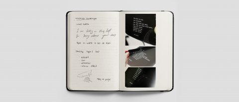
Sketchbook research for workshop challenge - Week 10.
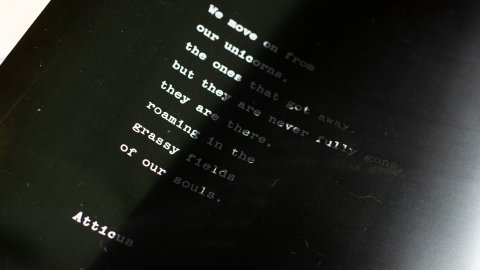
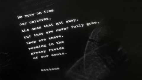
Photographys of the type design printed onto acetate.
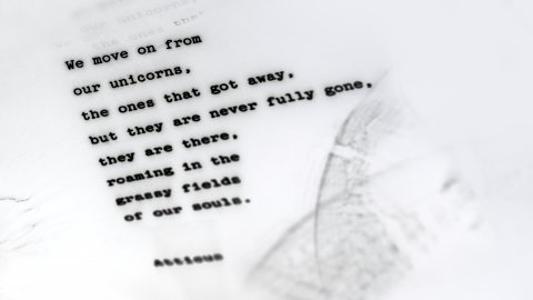
Final type design.
I took an exert from a poem written by Atticus. I used an original typewriter font with kerning reminiscent of that Style. Wide, spaced out leading together with left alignment and line breaks more commonly associated with poems created an old-worldly feel you would get from a typed letter or book.
The emotion of the poem is a juxtaposition of reflective sadness and fond memories of the past. I printed the text onto black acetate and then photographed the sun reflecting the copy onto a sheet of paper below. The text blurs in sections as if those words entered another spiritual dimension. The light reflection also created shadows that mimicked a visual of the human eye and duplicated the copy in a ghost-like fashion in sections. The composition distorts with the reflection losing clarity and getting smaller towards the end of the poem as if those words are about to dissolve or drop off the page. I inverted the image to add texture and a sense of spread to the letters as if they too are not constant but moving back and forth between memories. I feel the typography is genuinely a soulful reflection of the poem.
REFLECTION
The research material and lecture this week felt more like a recap of typography lectures I experienced in school combine with a printing history lesson. Sometimes it is good to return to the basics as it provides a strong foundation onto which all design skills are built.
The early printmaking process was something I found fascinating. The level of skill, craft and painstaking precision creates a sense of appreciation for artisanal talents that now seem lost in time. Technology has allowed the printing process to develop and evolve at an exponential rate with computers instead of artists turning the wheels.
Together with the workshop challenge, there was a sense of stepping away from the computer and returning to craft. Technology provides us with endless opportunities and speed of execution, but there is something that speaks to the heart of a designer about the slow, meticulous artistry of craft. Emotion and expression embody the work on a more profound level when hands instead of a keyboard execute a design. The results become multidimensional pieces of original, thought-provoking art.
Reference: Chapman, C., 2020. Understanding The Nuances Of Typeface Classification. [online] Toptal Design Blog. Available at: <https://www.toptal.com/designers/typography/typeface-classification> [Accessed 27 November 2020].
Reference: Baines, P. and Haslam, A., n.d. Type and Typography. Laurence King, pp124-145.
Reference: Regular Practice. Typogrpahy, Module GDE701, Contemporary Practice.
Reference: Gundry, 2020. Why Is Typography Important? [online] Quora. Available at: <https://www.quora.com/Why-is-typography-important> [Accessed 27 November 2020].
Reference: Charchar, A., 2012. When Typography Speaks Louder Than Words — Smashing Magazine. [online] Smashing Magazine. Available at: <https://www.smashingmagazine.com/2012/04/when-typography-speaks-louder-than-words/> [Accessed 24 November 2020].
Reference: Ashworth Creative. 2014. A Brief History Of Typography & Typefaces - Ashworth Creative. [online] Available at: <https://www.ashworthcreative.com/blog/2014/07/brief-typography-typefaces/> [Accessed 24 November 2020].
Reference: Forest, B., 2020. The History Of Typography. - Animated Short. [image] Available at: <https://youtu.be/wOgIkxAfJsk> [Accessed 24 November 2020].
Reference: Material Design. n.d. Material Design. [online] Available at: <https://material.io/design/typography/understanding-typography.html#system-fonts> [Accessed 23 November 2020].
Reference: Carton, A., 2020. What Is Typography? Why Is It Important For Graphic Designers?. [online] Designhill. Available at: <https://www.designhill.com/design-blog/what-is-typography-why-is-it-important-for-graphic-designers/> [Accessed 24 November 2020].
Reference: Hannah, J., 2020. What Is Typography, And Why Is It Important? A Beginner’S Guide. [online] Careerfoundry.com. Available at: <https://careerfoundry.com/en/blog/ui-design/beginners-guide-to-typography/> [Accessed 24 November 2020].
Reference: Milpedras.com. 2010. BRIEF HISTORY OF THE PRINTING. [online] Available at: <https://www.milpedras.com/en/noticias/67/brief-history-of-the-printing/> [Accessed 24 November 2020].
Figure 1: Dover Press, 2020. History Of Print. [image] Available at: <https://dovetonpress.co.uk/history-of-print/> [Accessed 28 November 2020].
Figure 2: Knight, C., 2020. When Typography Speaks Louder Than Words. [image] Available at: <https://www.smashingmagazine.com/2012/04/when-typography-speaks-louder-than-words/> [Accessed 28 November 2020].
Figure 3: Charmichael, A., 2010. Alison Charmichael Hope Poster. [image] Available at: <http://www.dontpaniconline.com/magazine/arts/alison-carmichael-hope-poster-artist> [Accessed 28 November 2020].