RESEARCH
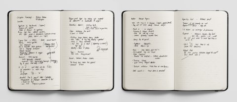
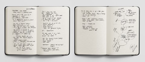
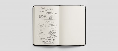
Sketchbook research, analysis ideas for Week 2.
Whenever we encounter language in written form, we see typography design that creates an impression and affects the perception of what we read, society, culture and the environment around us.
Colophon Foundry and Smörgåsbord creation of the typeface Cymru Wales Sans, Cymru Wales Serif and Cymru Wales Transport for the Welsh Government, illustrates the power and influence of typography (Smörgåsbord and Colophon Foundry create a type family that captures the spirit of Wales — The Brand Identity, 2021). The typeface celebrates the Welsh spirit and heritage (Wong, 2020) while communicating a 'sense of place'. Wales is authentically presented to the world without parody or cliché. The typeface contemporized its identity while eluding its history (Foundry, 2021) and heritage with a sense of newfound pride.
Extensive research into the Welsh identity, language, typography and medieval heritage and advisory partnerships such as a Welsh linguistics professor provided invaluable knowledge to inform the typeface's creation (Foundry, 2021). The typeface takes cues from Welsh typographic heritage and history, including medieval texts such as the Black Book of Carmarthen and the Red Book of Hergest and characters found in other minority languages like Icelandic and Arabi script (Wong, 2020).
The result was a legible, contemporary san serif type family with a distinctive graphic language (Wong, 2020). Beautiful in its detailing and nuances from the harp style hooks, kinks, and the arching back of letters. The Welsh language omits individual letters and comprises 28 total characters with the inclusion of eight digraphs (Foundry, 2021).. These flowing cursive digraphs set the tone for the typeface and put the Welsh language front of modern identities.
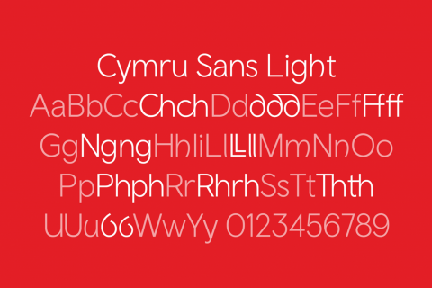
Fig. 1: Colophon-Foundry, n.d.
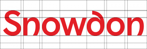
Fig. 2: Colophon-Foundry, n.d.

Fig. 3: Colophon-Foundry, n.d.
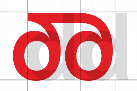
Fig. 4: Colophon-Foundry, n.d.
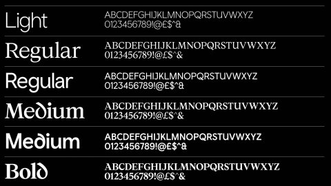
Fig. 5: A typeface has been designed for the Welsh language, 2020.
The OpenType gave designers a forward-thinking tool to create visual and cultural gestures within the typography that would carry the typeface into the future. Both Celtic and Gaelic informed several consonants, providing a foundation to dial-up or tone down the text, from expressive headlines to more staid, formal texts (Smörgåsbord and Colophon Foundry create a type family that captures the spirit of Wales — The Brand Identity, 2021). Different weights and cuts of the font are used for different audiences within the Welsh Government. CW Sans Transport is designed in all CAPS specifically for the transport sector to aid in navigation and legibility while driving.
The typeface is now part of the Welsh National Brand.

Fig. 6: A typeface has been designed for the Welsh language, 2020.
ANALYSIS
Design is creative problem-solving through a process of styling environments, people, cultures and lifestyles. It has the power to persuade and empower. The core purpose is to make life, society and the world a better place.
The environmentally sustainable, free typeface, Ryman Eco, launched by UK stationery retailer Ryman and designed by Monotype Director Dan Rhatigan, in collaboration with Grey London, uses 33% less ink than standard fonts. If everyone used the new font, we could save 490 million ink cartridges and lower CO2 emissions by over 6.5 million tones (Rayapura, 2015).
The beautiful, sustainable font balances saving ink with legibility, aesthetics and beauty. Each form is a series of fine lines which allows smaller sizes to appear merged from ink bleed, whereas larger sizes become interesting visual characteristics of the typeface (Rayapura, 2015). The last printing revolution shaped the world; this design element could save it (Youtube, 2014).

Fig. 7: WPP, 2021.
In Paris, design is being used as a conduit to draw people away from the famous city centre to a more authentic French experience in the suburbs using infrastructure, art and culture as tools to effect change (Creative Reivew, 2018). An example closer to home is that of Woodstock in Cape Town, a suburb that was historically a manufacturing neighbourhood with affordable housing for workers. Unfortunately, as factories closed, it became increasingly rundown and impoverished, but design-driven social change has now stemmed this tide (Floornature, 2021).
The creative revolution began when a disused biscuit factory, The Old Biscuit Mill, was renovated into a location for design studios, artists, and a weekly neighbourhood market, injecting new life into this neighbourhood on the city's outskirts. Today, numerous design businesses, agencies, galleries, eateries and mid to upmarket housing developments have popped up – making it a paradise for design lovers and the general public.
The area, now known as the Woodstock Design District (Floornature 2021), a neighbourhood in constant flux It has an annual guide produced by The Guild Group and Monday Design. The Woodstock Design District Map compiles the best design stores, art galleries, workshops and artisanal food stops that make navigating the area easier for locals and tourists alike. The map highlights the area's desirability to tourists and locals alike, attracting further investment and improvement of the ear (Woodstock Design District - Guild Group, 2021).
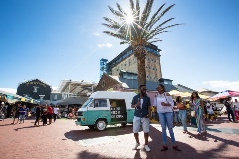
Fig. 8: (The Old Biscuit Mill, n.d.)
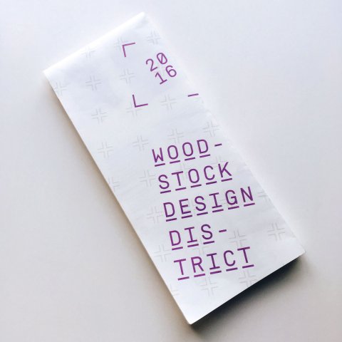
Fig. 9: The Guild Group, n.d.
The restaurant Noma, opened in 2003 in Copenhagen's Christianshavn neighbourhood, pioneering a new perspective in Nordic cuisine and igniting a cultural revolution(Creative Reivew, 2018). Rejecting the long-established idea that fine dining necessitated classical French cooking, chefs Claus Meyer and Rene Redzepi created a seasonal and local menu, utilizing traditional regional cooking methods (Noma, 2021).
The celebration of Danish heritage gained momentum and inspired the New Nordic Movement (MORRIS, 2020). An innovative, creative approach to traditional foods combined with a strong focus on health and an ethical production philosophy uncovered elements of local history and culture (Everything You Need to Know about New Nordic Cuisine, 2021). From award-winning restaurants in Copenhagen to Finnish tapas in Helsinki and Nordic government institutes regional food policies promotions, a reinvigorated identity and celebration of Scandinavian heritage was born from a restaurants creative ideology.
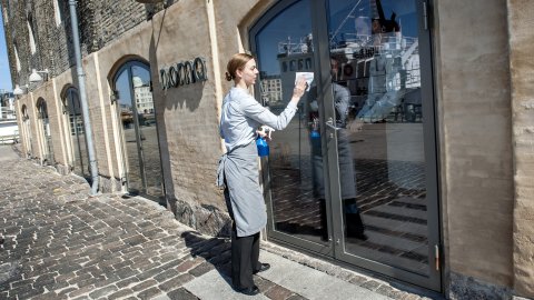
Fig. 10: Keld Navntoft, 2013.
Design can also inspire imagination and creative campaigns that deviate from the traditional cliches and inject fresh energy that attracts an audience for its authenticity and innovation of thought. Insight and strategy informed The Swedish Number, a Swedish tourism board campaign to leverage national pride and boost interest in visiting the country (Creative Reivew, 2018). People call +46 771 793 336, and they are connected to a random Swedish citizen and can chat about any subject – from politics to culture, women's rights to entertainment and all things Swedish. The campaign sought to inspire curiosity.
The uniqueness and originality of thought sparked worldwide curiosity with 170,000 calls from 186 countries, 9 billion impressions, and millions in media value with zero media spend. Due to the campaign's success, The Swedish Tourist Association and Stockholm-based agency INGO gave the country its very own telephone number (Insight & Strategy: The Swedish Number, 2021).

Fig. 11: Insight & Strategy: The Swedish Number /, 2016
It is our crucial responsibility as designers to use our skills to effect positive change. We have the power to create lasting identities, influence cultural and social behaviour and perceptions. We should be inspired by the knowledge that we can make the world a better place.
WORKSHOP CHALLENGE
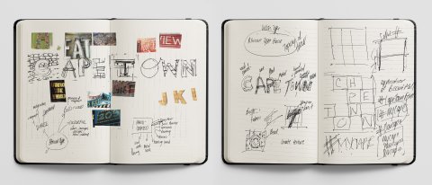
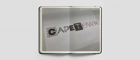
Sketchbook Workshop Challenge ideas for Week 2.
Cape Towns is a culturally rich and diverse city, inhabited by various African tribes, Dutch, French, German, British and Cape Malay. This diverse community identify as African and embody a bold, vibrant, soulful energy awash with colour and artistry. With limited means, this city achieves innovation and craft across various mediums - mosaics, intricate wirework, wood carvings, graffiti and hand painting exhibited through business, fashion, signage and wall art.
Drawing from last weeks historical and visual reference I have created the ‘Mother City Font’. Hand-drawn typography is visually interpreted in the colours, materials and execution-style seen throughout the city. Beadwork, wiring and woodcarvings showcase an eclectic mix of colours and craft.
The type weights vary as a stylistic representation of the many cultures inhabiting the city.
I imagine this font being used in a citywide campaign where local artists are employed to create large scale signage where each letter is artisanally crafted to form an art piece. These signs would then be exhibited in various locations throughout the city to develop a sense of pride at home and wonder for tourists. From the Gogo’s – African Grandmothers beading a giant T, to carpenters carving an N and smithers masterfully wiring the letter A.
People could take pictures next to the signage and share it on social media, tagging #MyCity. The campaign's objective would be to create global awareness of the diverse range of skilled African Craftsman Cape Town offers, offer employment to smaller community tradesman, uplift the overall economy and build a sense of citywide pride.

Black and white vector of the Mother City Typeface spelling out Cape Town.

Full colour vector of the Mother City Typeface spelling out Cape Town.

An example of a location in Cape Town - Bo Kaap placed within the Mother City Typeface to showcase it's colour and spirit.
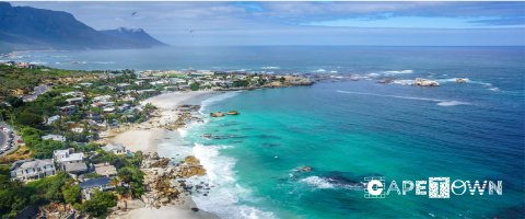
Single colour application of the Mother City Typeface spelling out Cape Town placed onto a tourism promotional poster.
REFLECTIONS
All groundbreaking ideas and creative concepts carry both risk and reward. By analysing the success and failures of different agencies and campaigns, I can ascertain that it takes courage to leave a lasting impact on the world.
To effect positive change that is well received and implemented requires originality of thought and daring in the face of globally repetitive branding. Stay true to the character, quirks, essence and authenticity of a brand, city or principal. A delicate touch is more effective than a hammer.
The broader your knowledge base and understanding, the better chance you have for success. Risk can be mitigated through extensive research and consulting with experts in a given field can aid your endeavours.
Saving the world, creating meaningful and lasting cultural and social change does not come easy. It is our responsibility as designers to be courageous and use our skills to effect positive change.
Reference: Tolley, S; Lecture Presentation, Module GDE720, History and Futures. [Accessed 28 January, 2021].
Reference: Foundry, C., 2021. Wales — Colophon Foundry. [online] Colophon Foundry. Available at: <https://www.colophon-foundry.org/custom/wales/> [Accessed 4 February 2021].
Reference: The Brand Identity. 2021. Smörgåsbord and Colophon Foundry create a type family that captures the spirit of Wales — The Brand Identity. [online] Available at: <https://the-brandidentity.com/feed/smorgasbord-colophon-foundry-create-type-family-captures-spirit-wales/> [Accessed 4 February 2021].
Reference: Wong, H., 2020. : A family of fonts has been designed for the Welsh language. [online] Design Week. Available at: <https://www.designweek.co.uk/issues/16-22-march-2020/a-typeface-has-been-designed-for-the-welsh-language/> [Accessed 4 February 2021].
Reference: Guild Group. 2021. Woodstock Design District - Guild Group. [online] Available at: <http://theguildgroup.co.za/woodstock-design-district/> [Accessed 4 February 2021].
Reference: Floornature.com. 2021. Woodstock the Design District of Cape Town South Africa. | Livegreenblog. [online] Available at: <https://www.floornature.com/blog/woodstock-the-design-district-of-cape-town-south-africa-9365/> [Accessed 4 February 2021].
Reference: Typeroom.eu. 2019. In Earth we trust: Ryman Eco is a sustainable font for all - TypeRoom. [online] Available at: <https://www.typeroom.eu/article/earth-we-trust-ryman-eco-sustainable-font-all> [Accessed 4 February 2021].
Reference: Rayapura, A., 2015. Ryman Eco: The World's Most Sustainable Font?. [online] Sustainable Brands. Available at: <https://sustainablebrands.com/read/products-and-design/ryman-eco-the-world-s-most-sustainable-font> [Accessed 4 February 2021].
Reference: Youtube, 2014. Ryman Eco - The world's most beautiful sustainable font. [podcast] Available at: <https://www.youtube.com/watch?v=C4XcdpXtkmQ> [Accessed 4 February 2021].
Reference: MORRIS, K., 2020. What Noma did next: how the 'New Nordic' is reshaping the food world. [online] the Guardian. Available at: <https://www.theguardian.com/food/2020/feb/28/what-noma-did-next-new-nordic-food-rene-redzepi-claus-meyer-locavore-foraging> [Accessed 4 February 2021].
Reference: Insight Vacations. 2021. Everything You Need to Know about New Nordic Cuisine. [online] Available at: <https://www.insightvacations.com/blog/everything-need-know-new-nordic-cuisine/> [Accessed 4 February 2021].
Reference: UI - 50B - Restaurants - GLOBAL. 2021. Noma. [online] Available at: <https://www.theworlds50best.com/the-list/1-10/Noma.html> [Accessed 5 February 2021].
Reference: Contagious. 2021. Insight & Strategy: The Swedish Number. [online] Available at: <https://www.contagious.com/news-and-views/insight-strategy-the-swedish-number> [Accessed 5 February 2021].
Reference: CREATIVE REVIEW, 2018. The CR podcast episode 14: Making, changing and documenting places. [podcast] The CR podcast episode 14: Making, changing and documenting places. Available at: <https://www.creativereview.co.uk/the-cr-podcast-episode-14-making-changing-and-documenting-places/?nocache=true&adfesuccess=1> [Accessed 5 February 2021].
Image 1-4: 2020. A typeface has been designed for the Welsh language. [image] Available at: <https://www.designweek.co.uk/issues/16-22-march-2020/a-typeface-has-been-designed-for-the-welsh-language/> [Accessed 5 February 2021].
Image 5-6: Wales, n.d. [image] Available at: <https://www.colophon-foundry.org/custom/wales/> [Accessed 5 February 2021].
Image 7: WPP, 2021. ProBono Work. [image] Available at: <https://sites.wpp.com/probono/2014/showcase/?load=48> [Accessed 5 February 2021].
Image 8: THE OLD BISCUIT MILL, n.d. Welcome to The Old Biscuit Mill. [image] Available at: <https://theoldbiscuitmill.co.za> [Accessed 5 February 2021].
Image 9: The Guild Group, n.d. The Woodstock Design District Map was a curated guide to the Cape Town neighbourhood with the highest density of design studios and art galleries in the country.. [image] Available at: <http://theguildgroup.co.za/woodstock-design-district/> [Accessed 5 February 2021].
Image 10: NPR, 2013. 'World's Best Restaurant' Blamed For Diners' Illnesses. [image] Available at: <https://www.npr.org/sections/thetwo-way/2013/03/08/173847217/worlds-best-restaurant-blamed-for-diners-illnesses> [Accessed 5 February 2021].
Image 11: 2016. Insight & Strategy: The Swedish Number /. [image] Available at: <https://www.contagious.com/news-and-views/insight-strategy-the-swedish-number> [Accessed 5 February 2021].