RESEARCH


Sketchbook research, analysis ideas for Week 3.
A picture is worth a thousand words.
In a digital age of overwhelming information, designers have the power to visually communicate vast amounts of complex data in a simple graphical form that enables understanding (Infographics: The Power of Visual Storytelling, 2021).
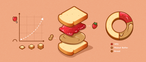
Fig. 1: Richie, 2021.
I see infographics as one of the most powerful tools in a designers arsenal. An infographic is a form of visual communication that captures attention and enhances comprehension (Ritchie, 2021).
Infographics fall into three categories:
· Data visualisation
· Information design
· Editorial infographics
Data visualisation
A visual representation of data that uses design aesthetics to increase the understanding of data and recognise trends. Recognised in the form of bar charts, pie charts and graphs.
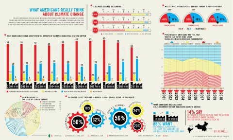
Fig. 2: Richie, 2021.
Information design
A visual representation made from concepts instead of information to create structure and order.
Recognised in the form of flowcharts, organisational diagrams, timelines, instructional diagrams, anatomical illustrations and cartography.
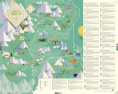
Fig. 3: Richie, 2021.
Editorial infographics
A visual representation that employs a narrative approach in editorials and publications, designed to have mass appeal and broad distribution potential. Recognised in the form of simple bars, lines, pie charts (Infographics: The Power of Visual Storytelling, 2021).
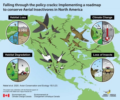
Fig. 4: Twitter, 2020.
Infographics allow you to tell a story uniquely and engagingly. The story you are telling and the platform you are using should influence your choice of format :
· Static infographics
· Animated infographics
· Interactive infographics
Static infographics
Simple infographics used in blogs, articles, brochures and print, made interesting through-line art, illustration, photography and more.
Animated infographics
Animated infographics such as GIFs are engaging, grab an audience's attention and enhance online articles and tutorials. Ideal for use in social contexts.
Interactive infographics
Require an action or input from the viewer, which creates an interactive infographic where the viewer can either explore data at will or be guided through a contained narrative. They are ever-changing and intriguing because of this fact (Sheikh, 2021).
Key elements to creating infographics:
A strong brief
Accurate data sources
Tell a story
Clear design communication - "I strive for two things in design: simplicity and clarity. Great design is born of those two things." Lindon Leader (Lingnini, 2014).
ANALYSIS
What is the purpose of visual communication, specifically infographics?
Human beings are visual creatures and in a world of such vast technological pollution, visually presenting information and data enables effortlessly understanding. Designers are empowered to refine and translate complex information to 'tell a story' or reveal something clearly, simply and effectively. The result enables learning and education that can influence, change perspective, opinion and behaviour.
Infographics are also a creative medium to shape data, numbers, and disconnected facts to provide innovation and insights if imagined differently (McCandless, D. 2010).
There is a clear, simple, unique and universal understanding of navigation. A traffic light with a green man walking indicates 'go', and a red man means 'stop' no matter where you are in the world. Harry Beck's (Damon, 2003) map of the London Underground and Gary Hustwit's (Monotype, 2021) map for the New York subway are clear in their simplicity, stylisation, colour coding and engineering. The navigation of complicated infrastructure practically and straightforwardly was enabled through their ingenuity in infographics.
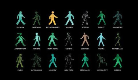
Fig. 5: Telegraph, n.d.
Students are visual creatures who pay more attention to images and graphic representations of information than text. In education, infographics enable enhanced learning and interpretation by breaking down complicated concepts into understandable pieces of information that aid retention, and information absorption. Research shows that students perform task 323% better when directions include illustrations in addition to text. Infographics are a great educational tool that can help students connect and inspire engagement with the material.
Infographics are a lifesaving tool concerning health and education. The spread of Ebola, according to the World Health Organization, is increasing exponentially. In an illiterate country like Liberia, infographics are a crucial form of communication and education. The public is being warned about the deadly Ebola virus through hand-painted murals illustrating the symptoms and treatment process, which could potentially save lives (The Washington Post, 2021).

Fig. 6: Freedom du Lac, 2014.
Florence Nightingales Rose Diagram in 1858 illustrated the number, and more importantly, the causes of deaths soldiers suffered during the Crimean War (Giamio, 2017). At a glance, one can ascertain that more soldiers died from preventable diseases than from battle wounds (Atlas Obscura, 2017). After coming to the Queen's attention, the 'Rose Diagram' effected widespread changes to the standards and practices of warfare and mass sanitation. Given the scale of wars that consumed the occurred after this time, Nightingale saved countless lives through her work and infographic (Florence Nightingale; the mother of Infographics, 2013).
The apparent advantage of infographics is that if they're visually appealing, attractive and viewers will be drawn in and inspired to engage with the content. In a business context, this exposure is invaluable. Exciting and relevant images often reach and appeal to a broader audience, leading to more interaction, participation, and engagement. Tweets with images get 150% more retweets than those without pictures, and Facebook posts with images see 230% more engagement than those with text only. Many businesses are now using these tools to drive traffic to their websites, engage with and retain consumers' attention (The Power of Infographics in Online Education - Center for Teaching and Learning | Wiley Education Services, 2021).
Almost all infographic images' primary objective is to inform, but they can also carry an agenda. Though useful, data being visually represented can easily be skewed for political purposes. Graphic designers hold power to significantly impact the way people understand policy positions and advocate for them. When complex information from a political candidate, scientist, or government department needs to become more digestible to the viewer, infographics offer a neatly presented visual solution. There are many different ways to skew the interpretation of infographics. Most stem from manipulating the visual representation, including the highlighting, colour coding or font size increase of specific facts. Designers are the world gatekeepers, responsible for doing all that they can to keep visual representations honest and leave as little room for misinterpretation as possible (Medium. 2021).
In a digital age, a designers ability to take advantage of the power of infographics to communicate a message in the clear, simple, and attractive way is essential to enabling content to stand out against the sea of information.
WORKSHOP CHALLENGE
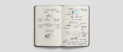
Sketchbook Workshop Challenge ideas for Week 3.
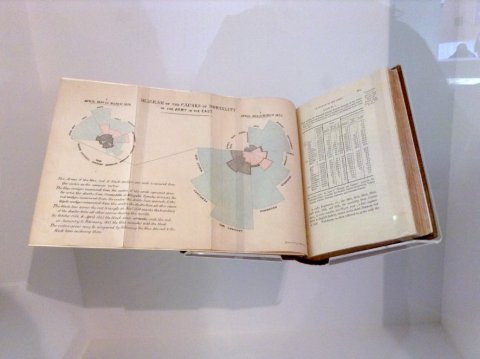
Fig. 7: Atlas Obscura, 2017.
Florence Nightingale, also known as the mother of infographics created the 'Diagram of the causes of mortality in the Army in the East' or graphic circular histogram called the 'Coxcomb' or 'Rose Diagram' (Nightingale – 1858 – the art of consequences, n.d.) in 1858 to illustrate the number and more importantly, the causes of deaths soldiers suffered during the Crimean War (Giamio, 2017).
She worked as a Superintendent of female nursing in a Military hospital in Turkey, where she observed and collected meticulous data on the lack of resources allocated to hygiene, nutrition and medical care, leading to more soldiers dying from preventable illness and decease than the battlefield. She used her passion for statistics and mathematics to create the 'Rose Diagram' (Florence Nightingale; the mother of Infographics, 2013). An innovative and imaginative way of showing a visually complex, data-centric representation in a transparent manner.
The construction of the infographic allows the user to instinctively and directly compare the significant causes of war casualties in a given month and across the course of a campaign. At a glance, one can ascertain that more soldiers died from preventable diseases than from battle wounds (Atlas Obscura, 2017).
The chart and its addendum represent time, deaths by illness, deaths from battle, deaths from other factors, and location.
The pie wedges in the chart are cumulative. Each wedge represents a distinctive figure of the total casualties from a month of the war. Each layer within that wedge is measured from the centre of the circle to its boundary.
Colour is used to differentiate these boundaries and draws attention to the causes of death they represent.
Red: Deaths caused by wounds
Black: Deaths from other causes
Blue: Deaths caused by diseases
The colours of the diagram are both striking and inviting and may represent the Union Jack and thus strike an emotional chord with the British Royal Government Audience to whom it was presented. The muted colours are respectful of such a sad subject as the wasted deaths of so many soldiers.
Nightingale's uses four fonts to help the user intuitively navigate the work. The labels use a blockish, linear, easy to read sans serif font for essential statistical information, which contrasts beautifully with the cursive description. The fonts reinforce the visual flow, engaging the user with the context and most critical information first before offering an explanation and call to go deeper into the data.
The two year periods and irregular months are not cluttered in one diagram but instead split with one year reaching across the page to connect to the second by a simple, dotted line enabling clear and effective communication. The first year's representation is larger than the second and naturally draws the viewers eye to the most damning evidence, while the line guides them to the following year and description (Nightingale – 1858 – the art of consequences, n.d.).
Nightingale knew that politicians and civil servants would struggle to understand complex data and statistics tables, and only a clear presentation would enable understanding and effect positive change. Her diagram caught the Queen's attention who established the Royal Commission on the army's health which effected widespread changes to the standards and practices of warfare and mass sanitation.
The 'Rose Diagram' was the first data visualizations to shape policy with its striking, innovative, and adaptive design presented in a harmonious, aesthetically pleasing way. Given the scale of wars that consumed the occurred after this time, Nightingale saved countless lives through her work and infographic (Florence Nightingale; the mother of Infographics, 2013).
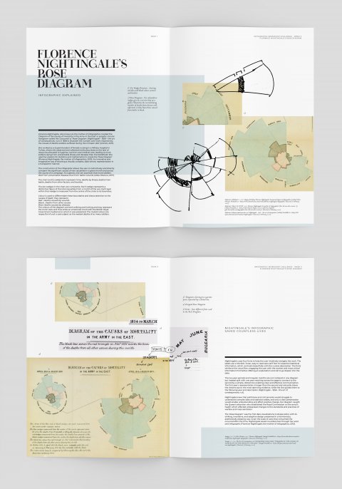
Florence Nightingale's Rose Diagram Infographic Editorial Translation.
REFLECTIONS
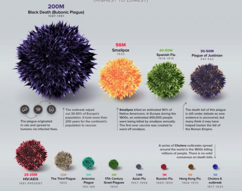
Fig. 8: COVID-19 put in historic perspective - What Design Can Do, 2020.
This week's lectures and research material provided a lightbulb moment in the power, influence, and impact infographics have at the moment of comprehension or realisation.
The COVID-19 virus has turned the world economies upside down and still heavily dictates our life trajectory. There are many vastly contrasting views on the subject. Still, the image that came to mind concerning this weeks content was the COVID-19 infographic by Visual Capitalists released around the start of the outbreak.
It put all the irrational fear and uncertainty into perspective with comparative data and facts around the mortality rate compared to past historical epidemics. COVID-19 didn't come near the death toll of 40 to 50 million by the Spanish flu a century ago, or the 25 to 35 million from HIV/AIDS (What design can do, 2020).
Many interactive infographics have also allowed people worldwide to track the virus's real-time effects, giving the viewer clarity and perspective. Yet, the figures still come nowhere near the 1/3 of the world's population killed by the bubonic plague. The image illustrated disease throughout the ages by colour and size to show the number of deaths. COVID-19 is a pinprick on the chart that puts the severity or lack thereof in perspective.
If only the world were full of more level headed individuals, instead of the hype and hysteria created by mass media.
Reference: McCandless, David (2008), Information is Beautiful (Links to an external site.), (New York: HarperCollins)
Reference: Morton, Timothy (2013), ‘Chapter 1: What Are Hyperobjects? and Chapter 2: The Time of Hyperobjects’ in Hyperobjects: Philosophy and Ecology after the End of the World (Links to an external site.), (Minneapolis: University of Minnesota Press).
Reference: Cheng, Joanne (2014, updated 2015) ‘Analyzing Minard's Visualization Of Napoleon's 1812 March (Links to an external site.)’, [online], Thoughtbot, 8 June, (Accessed: 7th December 2018)
Reference: Information is Beautiful (2018) Information is Beautiful (Links to an external site.), [online], (Accessed 10th December 2018)
Reference: McCandless, David (2010) The beauty of data visualization (Links to an external site.), [online] July, (Accessed: 7th December 2018)
Reference: Interaction Design Foundation (2016) Information Visualization – A Brief Pre-20th Century History (Links to an external site.), [online], (Accessed: 7th December 2018)
Reference: Felton, Nicholas (2015) Transforming data into meaningful stories | The Conference 2015 (Links to an external site.), [online], 14 January, (Accessed: 7th December 2018)
Reference: Ritchie, J., 2021. What Is an Infographic? Find Out What They Are and Why They're Useful. [online] Column Five. Available at: <https://www.columnfivemedia.com/infographic> [Accessed 10 February 2021].
Reference: O’Reilly Online Learning. 2021. Infographics: The Power of Visual Storytelling. [online] Available at: <https://www.oreilly.com/library/view/infographics-the-power/9781118421598/xhtml/Chapter04a.html> [Accessed 10 February 2021].
Reference: Lingnini, D., 2014. "I strive for two things in design: simplicity and clarity. Great design is born of those two things." | Port Clarendon. [online] Portclarendon.com. Available at: <http://www.portclarendon.com/openport/lindon-leader-quote/> [Accessed 10 February 2021].
Reference: Sheikh, M., 2021. What is an Infographic? (Examples, Tips and Templates). [online] Visme Blog. Available at: <https://visme.co/blog/what-is-an-infographic/> [Accessed 10 February 2021].
Reference: GIAIMO, C., 2017. Happy Birthday Florence Nightingale, Unexpected Queen of Infographics. [online] Atlas Obscura. Available at: <https://www.atlasobscura.com/articles/florence-nightingale-infographic> [Accessed 9 February 2021].
Reference: What's the PONT. 2013. Florence Nightingale; the mother of Infographics? (btw she was also a nurse…)j. [online] Available at: <https://whatsthepont.blog/2013/01/27/florence-nightingale-the-mother-of-infographics-btw-she-was-also-a-nurse/> [Accessed 9 February 2021].
Reference: Edspace.american.edu. n.d. Nightingale – 1858 – the art of consequences. [online] Available at: <https://edspace.american.edu/visualwar/nightingale/> [Accessed 9 February 2021].
Reference: The Art of Consequemces, n.d. DESIGNING WAR-CARE: “DIAGRAM OF THE CAUSES OF MORTALITY IN THE ARMY OF THE EAST”. [image] Available at: <https://edspace.american.edu/visualwar/nightingale/> [Accessed 9 February 2021].
Reference: What's the PONT. 2013. Florence Nightingale; the mother of Infographics? (btw she was also a nurse…)j. [online] Available at: <https://whatsthepont.blog/2013/01/27/florence-nightingale-the-mother-of-infographics-btw-she-was-also-a-nurse/> [Accessed 9 February 2021].
Reference: What Design Can Do. 2020. COVID-19 put in historic perspective - What Design Can Do. [online] Available at: <https://www.whatdesigncando.com/stories/covid-19-put-in-historic-perspective/> [Accessed 12 February 2021].
Reference: The Washington Post, 2021. This is how people are being warned about the Ebola epidemic in West Africa. [image] Available at: <https://www.washingtonpost.com/news/to-your-health/wp/2014/09/10/this-is-how-people-are-being-warned-about-the-ebola-epidemic-in-west-africa/> [Accessed 12 February 2021].
Reference: Damon, D., 2016. Johnston Sans: The Tube typeface that changed everything. [online] BBC News. Available at: <https://www.bbc.com/news/magazine-35916807> [Accessed 28 January 2021].
Reference: Monotype. 2021. Introducing Johnston100, the language of London. [online] Available at <https://www.monotype.com/resources/case-studies/introducing-johnston100-the-language-of-london> [Accessed 28 January 2021].
Reference: Center for Teaching and Learning | Wiley Education Services. 2021. The Power of Infographics in Online Education - Center for Teaching and Learning | Wiley Education Services. [online] Available at: <https://ctl.wiley.com/the-power-of-infographics-in-online-education/> [Accessed 13 February 2021].
Reference: Medium. 2021. The Power of Art in Politics:. [online] Available at: <https://medium.com/@kvelemir/the-power-of-art-in-politics-97abcd3b717f> [Accessed 12 February 2021].
Image 1, 2, 3: Ritchie, J., 2021. What Is an Infographic? Find Out What They Are and Why They're Useful. [online] Column Five. Available at: <https://www.columnfivemedia.com/infographic> [Accessed 10 February 2021].
Image 4: Twitter, 2020. We created this editorial infographic with @BirdsCanada for publication and their social media channels.. [image] Available at: <https://twitter.com/kapdesign/status/1276203738437476358> [Accessed 13 February 2021].
Image 5: Telegraph, n.d. Little Green Men: Iconic Pedestrian Lights Signal More Than Change. [image] Available at: <https://www.google.com/search?q=EDITORIAL+INFOGRAPHIC&client=safari&rls=en&sxsrf=ALeKk00dsJJqhA804wOeqriLFZ52zPBhTg:1613227808734&source=lnms&tbm=isch&sa=X&ved=2ahUKEwiTsezzjefuAhWStHEKHWYDDNgQ_AUoAXoECBkQAw&biw=1185&bih=768#imgrc=JPQS-62rx05d6M> [Accessed 13 February 2021].
Image 6: Freedom du Lac, J., 2014. This is how people are being warned about the Ebola epidemic in West Africa. [online] The Washington Post. Available at: <https://www.washingtonpost.com/news/to-your-health/wp/2014/09/10/this-is-how-people-are-being-warned-about-the-ebola-epidemic-in-west-africa/> [Accessed 12 February 2021].
Image 7: Atlas Obscura, 2017. Florence Nightingale. [image] Available at: <https://www.atlasobscura.com/articles/florence-nightingale-infographic> [Accessed 9 February 2021].
Image 8: What design can do, 2020. COVID-19 PUT IN HISTORIC PERSPECTIVE. [image] Available at: <http://(COVID-19 put in historic perspective - What Design Can Do, 2020)> [Accessed 12 February 2021].