RESEARCH
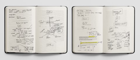
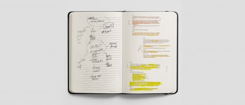
Sketchbook research, analysis ideas for Week 4.
Data analysis helps us understand history, current trends and issues, and forecast projected futures to make inspiring, informed decisions. Pioneering this process with new methodologies and creative execution are The Future Laboratory and Forensic Architecture.
The Future Laboratory
Data, research, and analysis can forecast future trends, consumer insight, foresight, brand strategy, cultural nuances, behaviour, innovation and understanding. The Future Laboratory is the world leader in trend forecasting and consumer insight strategies.
Made up of journalists, writers, visual researchers and innovation analysts, they deliver foresight to help harness market trends, understand and adapt to consumer needs, and create innovation in an industry or category.

Fig. 1: The Future Laboratory, n.d.
The Future Presentations inspire strategic thinking and insights into new areas of growth, trends, and tomorrow's compelling issues. The Food & Drink Futures Presentation unveils emerging trends and consumer attitudes that are shaping future appetites. The research covers new flavours, innovations, consumer needs and the market shifts that will define the sector in the years ahead.
The Future of Gender Presentation shows men embracing more diverse narratives around masculinity and women pushing for a more honest representation of their sex and a seat at the decision-making table. The presentation explores how both masculinity and femininity are being reframed and how brands have the opportunity to support this alternative and be a force for real change (Laboratory, 2021).
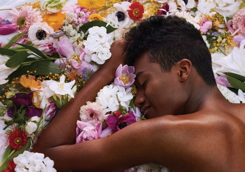
Fig. 2: The Future Laboratory, n.d.
With foresight, you can mitigate risk and make the right decisions.
Forensic Architecture
Using pioneering investigations techniques and technology in architectural analysis, digital modelling, research, interviews, and interdisciplinary collaboration, Forensic Architecture investigates human rights violations and police, military, corporation and state violence. They present this as evidence in political and legal forums, truth commission and human rights reports.
Forensic Architecture created models of the sequence of the Beirut Port Explosion incident that ripped through Beirut's port in 2020 as a free resource for investigators and civil society.
The open-source visual analysis and fluid dynamic simulation measured the concentration of tear gas the Chilian security forces released on peaceful protestors in 2019 to estimate the scale of health risks posed on civilians. The investigation creates awareness, context, and perspective by constructing digital and physical models, 3D animations, virtual reality environments and cartographic platforms to reconstruct and analyze the event. (Forensic Architecture, 2021).
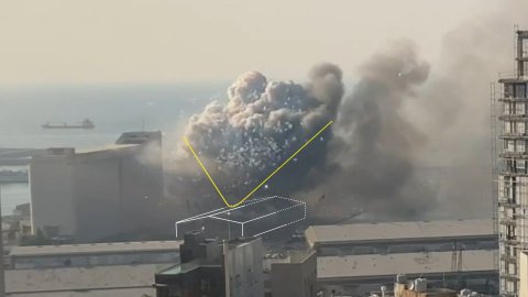
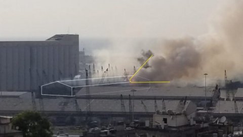
Fig. 3, 4: Forensic Architecture, n.d.
Knowledge is power. The more information we have at our fingertips, the more equipped we are to effect positive change.
ANALYSIS
Information Design has the power to communicate and transform our understanding of the world around us. It 'tells a story' and conveys an understanding of complex social, cultural, historical and scientific matters that give us a new perspective and shape future trends, needs and issues (Pochodzaj, n,d).
Vast and accurate information, data, expert insights and investigation into multiple sources are required to reveal a complete, accurate and unbias truth. The representation and communication of that information design have exponential transformative power. Some value their ethical responsibility to represent the truth accurately and others misuse and manipulate the context and narrative to serve an agenda.
In news and media, you have publications like the New York times that use a three-fold approach; information design supports the text, and text supports the images, and images bring life to the data in a broader context to encourage journalist accuracy (Pochodzaj, n,d). By comparison, the Wall Street Journal came under fire with media bias claims after it published two different versions of the centre-piece story on the same day, but with starkly different headlines and viewpoints showing blatant media manipulation (PolitiFact, 2019).
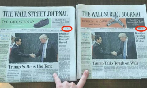
Fig. 5: PolitiFact, 2021.
Politics is rife with manipulation and cherry-picking of data to further an agenda. An example of this is a pole showing an 88% approval rate for Trump. The impression is that this is the collective United States opinion when it is merely that of the republican party (They're prepping for a race war, and they see Trump as their 'ray of hope', 2021). With behaviour like this becoming common practice, there is a break down in trust for governments, authorities and even a mistrust of each other.
Pictures make an argument about salient's importance and strength (The science of influencing people: six ways to win an idea, 2021).
The visual of a drowned Syrian child, Aylan Kurdi, tragically humanized the refugee crisis in Europe and did more to shift media reporting and public perception than any piece of information design (Smith, 2015). If designers can harness the power of emotion and imagery in information design, the result would be all the more impactful.

Fig. 6: The Guardian, 2021.
'If you can change perception, you can change emotion' – Edward de Bono.
Charles Booth, between 1886 – 1903 visualized inequality and poverty through in-depth investigation compiled in his revolutionary London Poverty Maps (Pochodzaj, n,d). He used colour coding to separate areas of London into:
Gold: Upper-middle and Upper classes. Wealthy.
Red: Well-to-do. Middle-class.
Pink: Fairly comfortable. Good ordinary earnings.
Purple: Mixed. Some comfortable, others poor.
Pale Blue: Poor. 18s. to 21s. a week for a moderate family.
Dark blue: Very poor, casual. Chronic want.
Black: Lowest class. Vicious, semi-criminal (https://www.klokantech.com/), 2021
The result was an indisputable visual of poverty in London at the time, which allowed the government to redirect support using old-age pensions, free school meals and policing. He transformed people's perception of poverty and directly impacted public policy. Today government census would collect information to achieve the same means.
The common perception of the London 2011 riots was one of vandalism and criminality. Motion and experiential design studio Field changed that narrative to reveal a more complex human story through human mapping resulting in beautiful visualizations of movement behaviour recast as a release of human energy (FIELD x The Creators Project — Energy Flow, n.d.).
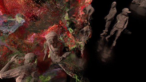
Fig. 7: Field, 2021.
Today more than ever, migration defines much of the processes that surround us, yet it's a subject that's only been considered as a 'refugee crisis' (Morley, 2021). The six-issue print publication Migrant Journal seeks to break from the prejudices and clichés associated with the term and reframe the narrative and perspective, exploring everything from the circulation of people and goods to information, flora and fauna. The transformative impact they have on contemporary life (Wood, 2021).
It calls on artists, journalists, architects and activists to rethink their approach to migration and critically explore the new spaces it creates while putting readers in contact with vastly differing viewpoints. Migration is a phenomenon everyone can relate to: landscapes result from various migratory processes, goods and foods that circulate worldwide are 'migrant' – all these form an understanding of migration that the journal brings to light (Wood, 2021)—from rural exodus in Japan, shifting glaciers in the Alps, maps showing how the UK gets its electricity from other countries, energy and internet that flow across cables globally. This information can make the public question putting up a wall if it cuts our connection?
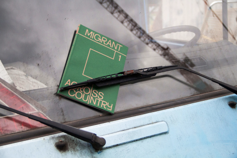

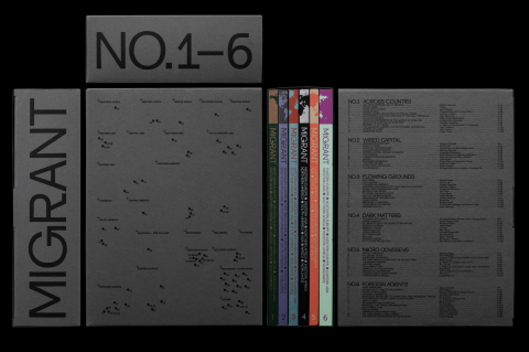
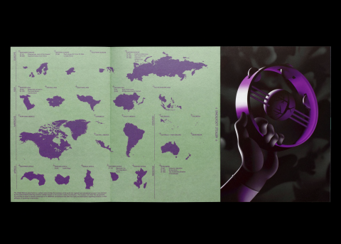
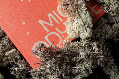
Fig. 8, 9, 10, 11, 12: Migrant Journal, 2021.
The truth is a simple fact; we, as designers, have an ethical responsibility to accurately represent the truth and without bias.
WORKSHOP CHALLENGE
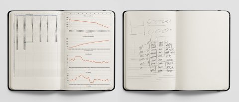
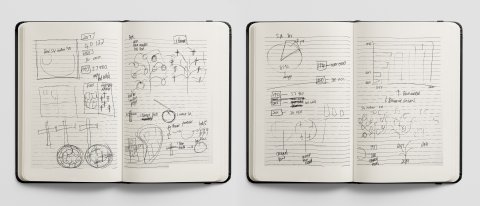
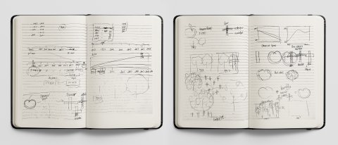
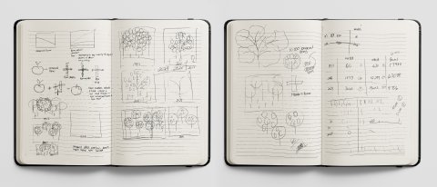
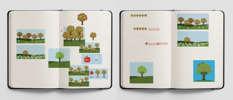
Sketchbook Workshop Challenge ideas for Week 4.
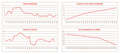
Graphs I created based on my statistical analysis of farm murders, farm attacks and the decrease in commercial farms in South Africa.
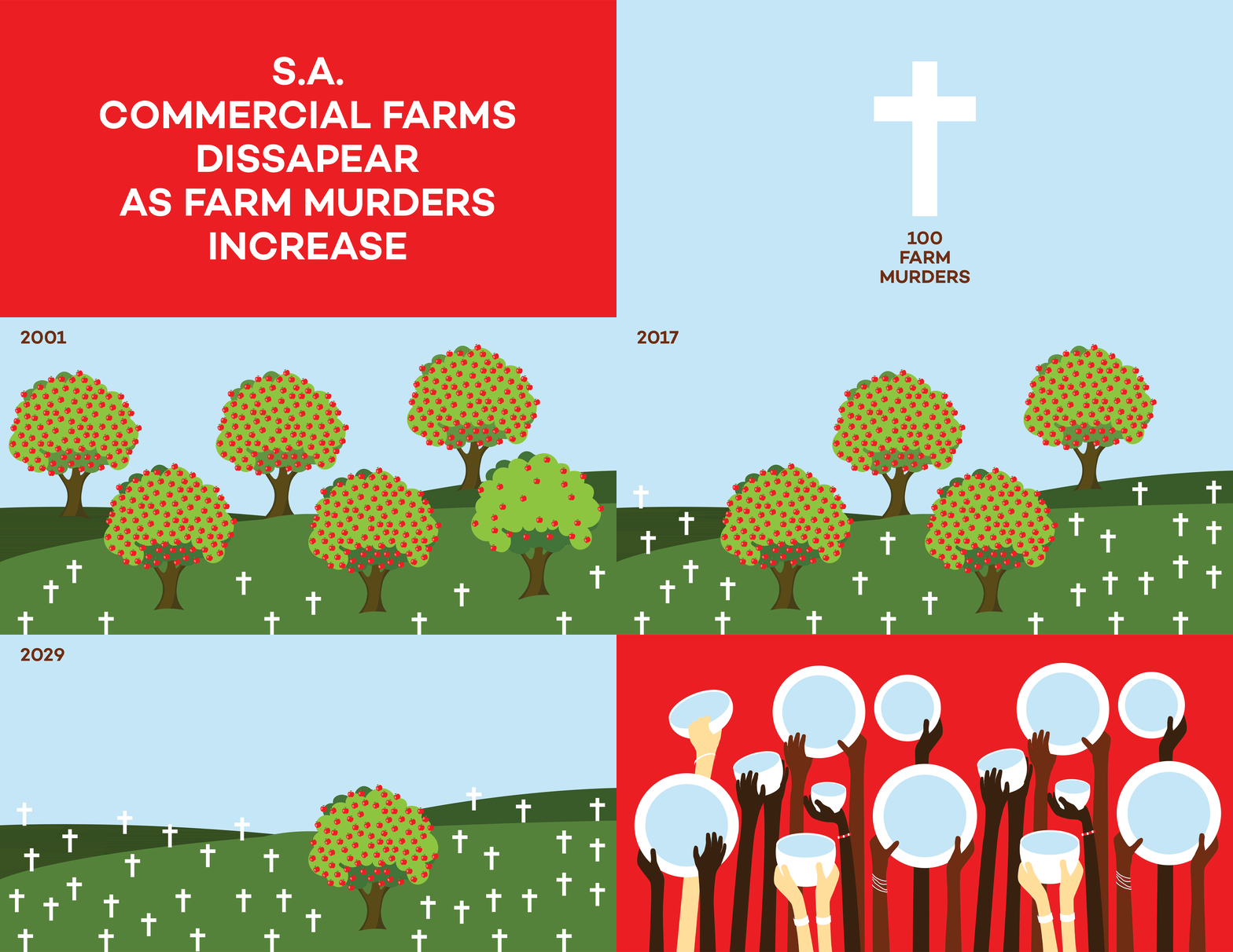
GIFF illustrating the dissapearance of S.A. commercial farms as farm murders increase.
Due to corruption, mismanagement of funds and a lack of fund allocation, accurate statistics are difficult to come by in South Africa. I conducted research and cross-checking across multiple platforms, including police, government, NGOs, and independent organisations databases, to paint an accurate picture of my chosen topic's current state of affairs.
Populism is rife in South Africa, where most of the population are ill-educated and live in poverty. Politicians fuel racism and hatred towards South African farmers, which has resulted in horrific attacks and murders on a scale close to genocide. With an escalation in farm attacks and continued farm murders, farmers are immigrating, urbanising, selling up or closing down. This has resulted in a catastrophic loss in commercial farms, which results in less food production and steeper food costs.
I needed to communicate my message in a clean, simple illustrative way to an illiterate country of multiple cultures and over twelve different languages. I narrated a story of vast and abundant apple trees representing commercial farms and white crosses to represent the graves of murdered farmers. As the graves multiply, they poison the land, and the apple trees die. Eventually, there will be no apple trees left, and South Africa will starve.
My message aims to get the population focusing on their future survival instead of hatred. If farm murders continue, South Africans are effectively killing themselves.
REFLECTION
My view of design has been relatively insular to date. The more I delve into the research and case studies, the more aware I am of the sheer power of design to create a narrative to effect positive change or manipulate to serve an agenda.
Fake news, paranoia and mistrust in authority, government and ourselves is evidence of the substantial misuse of this power. Therefore, it is comforting to read about organizations like Forensic Architecture and Future Lab (Future Labs, 2021) that value truth and honesty above profiteering and are fighting for a better world. We criticize the younger generation for naively loving liberal policy over profiteering, but perhaps their ideology will later be our saving grace.
In South Africa, we have an ANC government desperately clinging to power and pushing more populist agendas that do not serve South Africans' people. I find myself inspired to use information design to create awareness, understanding and perspective in a sea of disinformation.
There is a human need to tell stories and understand the world around us (Pochodzaj, n,d).
Reference: the Guardian. 2021. The science of influencing people: six ways to win an argument. [online] Available at: <https://www.theguardian.com/science/2019/jun/30/the-science-of-influencing-people-six-ways-to-win-an-argument> [Accessed 20 February 2021].
Reference: Smith, H., 2015. Shocking images of drowned Syrian boy show tragic plight of refugees. [online] the Guardian. Available at: <https://www.theguardian.com/world/2015/sep/02/shocking-image-of-drowned-syrian-boy-shows-tragic-plight-of-refugees> [Accessed 20 February 2021].
Reference: Field.io. 2021. FIELD x The Creators Project — Energy Flow. [online] Available at: <https://www.field.io/project/energy-flow/> [Accessed 20 February 2021].
Reference: Edition.cnn.com. 2021. They're prepping for a race war. And they see Trump as their 'ray of hope'. [online] Available at: <https://edition.cnn.com/interactive/2018/11/africa/south-africa-suidlanders-intl/> [Accessed 20 February 2021].
Reference: Image, V., 2019. PolitiFact - Did the Wall Street Journal run two different headlines on the same day to influence voters?. [online] @politifact. Available at: <https://www.politifact.com/factchecks/2019/mar/26/viral-image/did-wall-street-journal-run-two-different-headline/> [Accessed 20 February 2021].
Reference: Wood, B., 2021. Migrant Journal: a new magazine wants to change how we think about migration. [online] The Spaces. Available at: <https://thespaces.com/migrant-journal/> [Accessed 20 February 2021].
Reference: Morley, M., 2021. Migrant Journal, #1 — magCulture. [online] magCulture. Available at: <https://magculture.com/migrant-journal-1/> [Accessed 20 February 2021].
Pochodzaj, Joe. "Projecting a New Perspective." GDE720. Week 4, Lecture. [Accessed 12 February 2021].
Reference: (https://www.klokantech.com/), K., 2021. Charles Booth's 'Descriptive Map of London Poverty'. Detail showing the City of London and the East End. [online] Oldmapsonline.org. Available at: <https://www.oldmapsonline.org/map/britishlibrary/026MAP0000182C1U0000000C> [Accessed 20 February 2021].
Referene: Forensic-architecture.org. 2021. Forensic Architecture. [online] Available at: <https://forensic-architecture.org> [Accessed 20 February 2021].
Reference: Laboratory, T., 2021. The Future Laboratory - Our Story. [online] Thefuturelaboratory.com. Available at: <https://www.thefuturelaboratory.com/our-story> [Accessed 21 February 2021].
Reference: futurelabs.org. 2021. Future Labs. [online] Available at: <https://futurelabs.org> [Accessed 21 February 2021].
Image 1, 2: The Future Laboratory, n.d. The Future Laboratory. [image] Available at: <https://www.thefuturelaboratory.com/our-story> [Accessed 21 February 2021].
Image 3, 4: Forensic Architecture. [image] Available at: <https://forensic-architecture.org> [Accessed 21 February 2021].
Image 5: PolitiFact, 2021. Did the Wall Street Journal run two different headlines on the same day to influence voters?. [image] Available at: <https://www.politifact.com/factchecks/2019/mar/26/viral-image/did-wall-street-journal-run-two-different-headline/> [Accessed 21 February 2021].
Image 6: The Guardian, 2021. Shocking images of drowned Syrian boy show tragic plight of refugees. [image] Available at: <https://www.theguardian.com/world/2015/sep/02/shocking-image-of-drowned-syrian-boy-shows-tragic-plight-of-refugees> [Accessed 21 February 2021].
Image 7: Field, 2021. The Creators Project - Energy Flow. [image] Available at: <https://field.io/project/energy-flow/> [Accessed 21 February 2021].
Image 8, 9, 10, 11, 12: Migrant Journal. [image] Available at: <https://swissdesignawardsblog.ch/participants/mediation/migrant-journal> [Accessed 21 February 2021].