- RESEARCH
A timeline of historical publications
1909 - Manifesto of Futurism
• Filipo Tommaso Marinetti
• A dynamic, energetic movement that celebrated the modern world, industry and technology.
1914 – Blast Publication
• Wyndham Lewis
• A combination of abstraction, cubist fragmentation, hard edges, images of machines and urban environments.
• Launched Vorticism
1917 – DeStjil Journal
• Theo van Doesburg
• A reaction to excess that reduced form, colour, embraced abstract, simplified images, primary colours, and geometric shapes.
1928 – Die NeueTypographie
• Jan Tschichold
• A modern approach to typography that favoured simplicity, objectivity, legibility and san serif fonts.
• The Bauhaus and Russian constructivism inspired it.
1965 – Neue Grafik
• Josef Muller Brockman
• Swiss Style
• An architectural, minimal style of structure, grids, modern form and simplicity.
• Fonts such as Grotesk, Helvetic and Univers were used.
1947 – Thoughts of design
• Paul Rand
• Visually arresting images, simplified graphic shapes and reduced typography.
1957 – 1959 – Typografische Monatsblatter
• Emil Ruder
• Trade journal with modernist typography theories, precise text application in principals of legibility.-
-
-
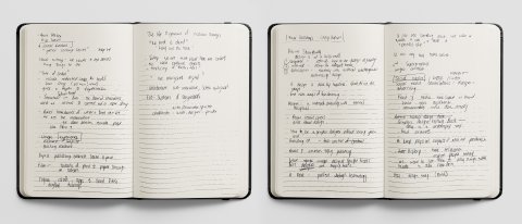
Sketchbook research, analysis ideas for Week 5.
Why do graphic designers write? The most straightforward answer is that we are the custodians of communication; it makes sense that we would embrace both visual and written communication. In the past, the reasoning was revolutionary and reactionary to wars, civil unrest and the industrial revolution. Designers vocalised pressing issues that engulfed society, established connections and debate while opening people's minds to new possibilities and direction (Why Do Graphic Designers Write Books, 2021).
Marinetti's Manifesto of Futurism sought to denounce the past and embrace the modern world of industry and technology in response to the industrial revolution. Wars and civil unrest throughout the 20th century influenced and shaped Theo Van Doesburg's DeStijl Journal, which rejected excess in favour of abstraction and simplification. Muller-Brockman's Neue Grafik responded to war's violence by seeking calm through architecture like structure and minimalism. Paul Rand's Thoughts on Design mimicked the rebuilding after world war two with a contemporary approach to simplified graphics and reduced typography.
Today visual culture writing, consumed by students and professional designers, is less revolutionary and more aspirational. Focusing on inspirational guides, trend analysis and beautifully produced historical monographs (Tolley, 2021).
Adrian Shaughnessy inspires students and designers alike with his book How to be a graphic designer without losing your soul. Unit Editions Supergraphics and Studio Culture set the tone and trend for future design and represent historical design content in a relevant, contemporary way for designers today (Shaughnessy, 2017). Anna Gerber and Britt Iverson's Visual Editions reinvent stories, bringing them to life and create an experiential design that inspires (Gerber, Iverson, 2011).
I think the future of design writing will be an interplay between design inspiration and the online technology that promotes the message, experience and engages with the audience in a symbiotic relationship.
ANALYSIS
Discover and analyse the relationship between written content and form, and identify the importance of structure, pacing and tone of voice when developing a piece of editorial content. Analyse how the relationship between typeface selection, layout, colour, materials, navigation and format can aid communication. Analyse digital and print production techniques used by designers to tell a story.
Everyone has their way of expressing themselves that's as unique as their fingerprint. What we verbally communicate gains emotion and comes to life through tone, pace and physical expressions. Visual writing is where text, art and design interlink to establish a tone of voice, unique experience, element of surprise or exciting response.
Where typeface, layout, structure, materials colours and format aid communication, the tangible nature of print and production illustrated by Tanamachi, Oldman, Tolley, Boom, Gerber and Iverson tells a story. With the world becoming more digital, uniquely crafted visual literature is more valuable than ever before.
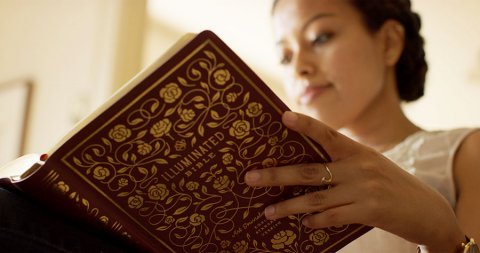
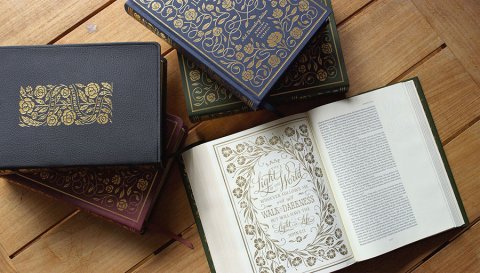
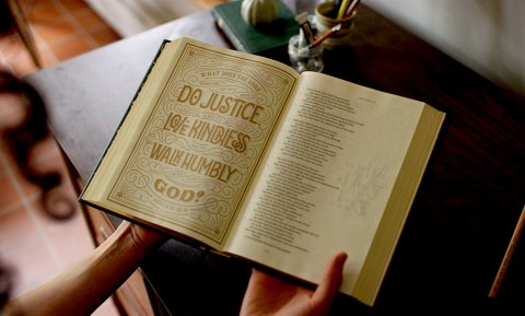
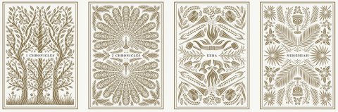
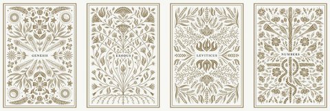
Dana Tanamachi – The Illuminative Bible-
-
-
-
-
-
Fig. 1, 2, 3, 4, 5, 6, 7: Illuminated bible, 2017.
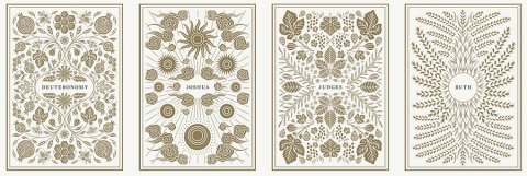
- Dana Tanamachi, an America lettering artist, graphic designer and illustrator, created 500 hand-lettered illustrations for the new edition of the bible. Together with a team of researchers, they pored over Biblical text, gathering themes, motifs, symbols, and imagery incorporated with text to honour each book's historical environment, context, and composition. For example, she included an illustration of a hyssop plant, the same branch on which Jesus was offered a drink while he was nailed to the cross in the Gospel of John.
Verse illustrations and thoughtful ornamentation drew inspiration from Art Noveau, Victorian typography, American wood type and woodblock prints. Full-page illustrations feature longer passages, giving readers a chance to linger on particular Scripture passages (Illustration Index - ESV Illuminated Bible, 2017). The biblical text is brought to life with visual stories, motifs and symbolism that enabled meaningful communication that honours God's word. -
-
Fig. 8, 9: Illuminated bible, 2017.
Craig Oldham - In loving memory of work-


- Fig 10, 11: Typetoken, n.d.
- In Loving Memory of Work is a visual record of the UK coal miners' strike from 1984 to 1985. The book is a collation of the political and cultural graphics from a very emotional, hard-fought dispute. The dust jacket cover, designed with a bespoke font inspired by placards, is screen printed using coal dust from an old South Yorkshire mine that creates a tangible and tactile connection of the reader to the mines.
The book features uniquely placed stickers that evoke the period where miners and protesters customised their belongings and placards with stickers associated with the strike (In Loving Memory of Work -D&AD, 2015).
The book is a labour of love and aims to inspire young designers to create meaningful work (Sidall, 2015). -
Fig 12: Typetoken, n.d.

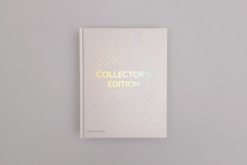
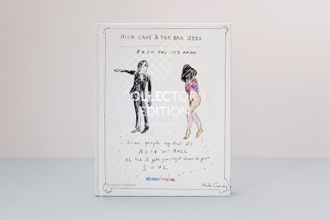
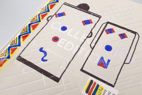
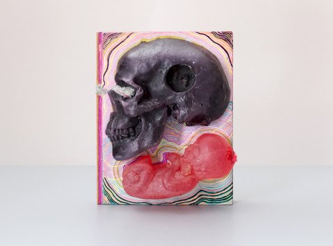
Collectors Edition, Innovative Packaging and Graphics – Stuart Tolley-
-
-
-
Fig 13, 14, 15, 16: Visi, 2014.
- The Collectors Edition book brings together over 170 examples of innovative and inspired packaging from the world of music, book publishing and magazines. In aid of the Alzheimer's Society charity auction, nine musicians and artists created individual artworks that visually reflected their featured music or art for the cover, including Sir Paul McCartney's (Gosling, 2021).
Wayne Coyne, the lead singer in The Flaming Lips, created an outlandish original reflecting the Gummy Skull music release. The book featured a wax skull and foetus on the cover with hand-decorated glitter and fluorescent ink, reflecting the band's psychedelic approach to music and live performance (Tolley, 2021). -
- Fig 17: Visi, 2014.
-
Tree of Codes – Anna Gerber and Britt Iverson -
Fig 18: World Literature Today, n.d.)
- Anna Gerber and Britt Iversen's imagination redefines the reading experience, where the text becomes the visual and the visual becomes the text.
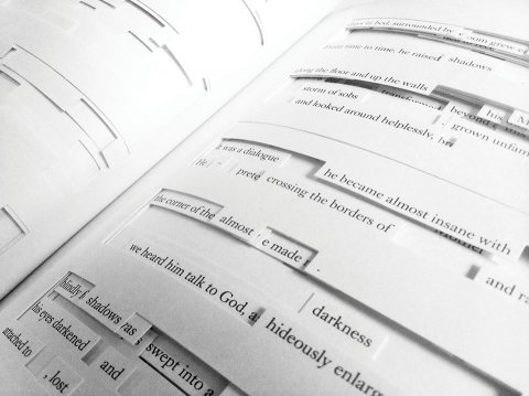
The Visual Edition paperback of Tree of Codes by Jonathan Safran Foer has an ordinary cover, illuminated once opened (Wood, 2021).
It is a book of gaps, each page showing massive holes where the text should be, with only the occasional word or phrase spared for the reader. The book is a censored version of Street of Crocodiles – cutting most of the terms to leave, or discover, a new story buried within. The narrative takes some decoding, and the story is a trail that the reader must find and lose and find again as they master this new immersive way of reading (Tree of Codes, 2021).
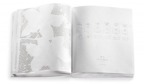
Chanel Livre D’Artistes – Irma Boom -
-
Fig 19, 20, 21: Book as Exhibition, n.d.
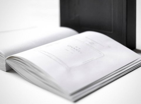
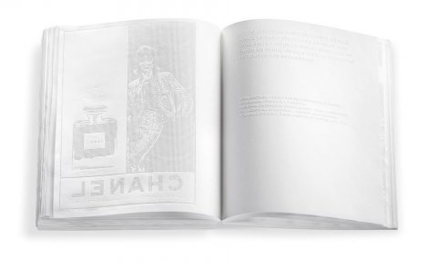
- The book features no ink. All text and hand-drawn images are either embossed or debossed to represent the invisible but ever-present nature of scent in a tactile manner (Irma Boom on standing up for yourself, even in the face of controversy, 2021). On her visit to Chanel, Boom was quoted, saying, 'What I smelt there was so intense and exciting it wasn't visible' (Barone, 2017).
Print is an extended part of the digital dialogue that works in collaboration with one another. Apps create immersive virtual experiences off the page; the web allows brands and publishers to access their audience, digital technology, and marketing facilitates and builds culture and valuable experiences that can be shared. In essence, digital is responsible for the counter-reformation, where publishers celebrate and experiment with physical books (Wood, 2010).
Adrian Shaughnessy and Unit Editions use social media as a marketing tool to access and converse with their audience (Element Talks, 2017). Craig Oldman created a short film showing the physical process of collecting and crushing coal to make the In Loving Memory of Workbook cover, which aids the narrative and emotional experience (It's Nice That, 2015).
"The picture-book is not, perhaps, necessary to man's life, but it gives us such endless pleasure, and it is so intimately connected with the other necessary art of imaginative literature that it must remain one of the very worthiest things towards the production of which reasonable men should strive" - William Morris.
WORKSHOP CHALLENGE


400 WORD ANALYSIS
Lady Cottington's Pressed Fairy Book – Terry Jones
The storybook, set at the turn of the 20th Century, takes the form of Lady Cottington's childhood journal into which she squashes and preserves fairies. She keeps a historical record of her growth into womanhood, picking out different fairies types along the way, which play tricks on her as she ages. The words in the book are interspersed with beautiful watercolour illustrations of squashed fairies.
The concept is masterfully executed in the design style of an old diary. Lady Cottington or Angelica writes her first entry in her diary when she is relatively young, which you gage from the youthful handwriting, grammatical and spelling errors. The crossed-out, handwritten words in fountain pen are historically accurate to the time. The large font size the t, the unsure writing style, child-like language, nervous excitement, tone of voice, and even positioning on the page create the distinct impression of a young girls diary entries.
As she gets older, her handwriting, spelling, and grammar improve and become more neat and refined. The font size decreases as too make the errors, and the volume of text increases. There is a sense of youthful energy evolving into discretion, intelligence, patience and perseverance in her fairy squishing adventures.
The stunning watercolour illustrations are bizarre, morbid, funny, and of excellent quality. Their positioning makes it seem like a little girl has caught some fairies mid-flight as they bleed off the page, or caught multiple at one time haphazardly captured across a double-page spread, or contorted into painful death poses. The structure and layout conform to a young woman's dairy, combined with squashed fairies in a parody of pressed flowers.
Near the end of the book, Lady Cottington happens upon a fairy brothel and captures some fairy's in a state of undress, which she politely seals to preserve the reader's innocence. The page's sealing creates intrigue and participation from the reader as if they are involved in the mystery and adventure. There is a sense that you are too young and innocent to be reading this section, and yet at the same time, your curiosity overwhelms you.
The author captures the shock, surprise and horror in a hysterically funny manner across multiple pages. There is a speed and haphazard arrangement in both illustration and typography as if the young girl squashing the fairies has done so with her eye's closed from shock and at times, perhaps with one eye open out of wonder and curiosity.
The enchanting story challenges your ideas about sweet little ladies and innocent fairy's. It strays from the traditional view of fairy lore while giving a very traditional ambience. It is a visual feast full of cheeky comments and imagery. You, as the reader, are entirely engrossed in the voyeuristic experience and adventure from start to finish. The tone of voice accurately conveying an innocent young girls journal entries and experiences through to that of adulthood with witty repertoire and illustrations.
CONCEPT IDEAS
I cannot fault the typographical execution, layout style and illustrations of the novel. I would, however, love to conceptually bring the spirit of voyeurism, adventure, and uncovered mystery to life with a limited edition print.
The diary would arrive in a wooden crate with the cover printed in a texture akin to dust as if it had been sitting in the attic for years, and the reader had just discovered it. You would then blow on the cover as if dusting it off, and the ink would react to your breath to reveal the title 'Lady Cottington's Pressed Fairy Diary'.
The pages would have a thicker, more textured feel to them, with ink bleeding through sections as it would do if written in felt tip pen. The ink would also blot onto the adjourning page as if Angela had slammed the book shut numerous times before the ink had dried.
The illustrations I would bring to life with embossing, debossing, 3D embossing and hybolt varnishes so that reader could feel the fairy on the page and perhaps even the indentation on the opposite page as if it had dented both pages after being squashed inside. To add to the adventure and surprise, pop up pages of fairies that jumped off the page at you would add to the excitement.
The sealed section about the brothel should have some pages torn out because they were too risky for even Angela to see and ink overlays that you could scratch away to reveal the naughty fairy beneath. It adds an interactive element to the design and reader participation. Some would just have the debossed indentations of fairies as if they had been caught in such a compromising pose that Angela had thrown them away afterwards to preserve her innocence.
The interactive, limited edition novel makes use of the print technique to bring the volume to life.


Concept ideas to bring the book to life.
REFLECTION
We are more visual today than ever before. We need cultural objects and tactility to offset an all-consuming digital world.
The inspiration from researched case studies this week into print production has been awe-inspiring. I now see printing as an unexpected, tactile, sculptural and even experiential medium (Al-Zaidy, 2013).
It sparked a conceptual direction for a mining clients brand evolution. The brand identity and stationery will now be centred around tactility and the connection everyday objects have to the earth from which they were mined. Embossings, debossing, and micro-engraved detailed foils of earth and mineral textures will add an elemental experience to the brand. Corporates can appreciate the high end, quality finishes and miners in rough locations will value the tactility that speaks directly to their occupation.
I plan to combine beautifully written copy about the mining process with this tactile approach to bring the story of mining to life.
-
-
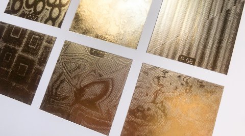
Syncron micro engraved foils
-
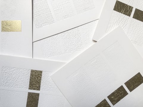
Syncron paperscapes


Reference: Youtube, 2021. TOC 2011: Anna Gerber & Britt Iverson, "Visual Editions: Part Revolution, Part Reinvention...". [image] Available at: <https://www.youtube.com/watch?v=JADarGx17Ok> [Accessed 24 February 2021].
Reference: Youtube, 2021. Nicer Tuesdays: Craig Oldham on Books. [image] Available at: <https://www.youtube.com/watch?v=rToKzDMIRPs> [Accessed 24 February 2021].
Reference: Youtube, 2021. Adrian Shaughnessy - The graphic designer as writer, editor and publisher. [image] Available at: <https://www.youtube.com/watch?v=RL1W3YdCasQ> [Accessed 24 February 2021].
Reference: ESV Illuminated Bible. 2017. Illustration Index — ESV Illuminated Bible. [online] Available at: <https://www.illuminatedbible.org/illustration-index/> [Accessed 24 February 2021].
Reference: Eye on Design. 2021. Why Do Graphic Designers Write Books?. [online] Available at: <https://eyeondesign.aiga.org/why-do-graphic-designers-write-books/> [Accessed 24 February 2021].
Reference: Anna Gerber and Britt Iverson, Visual Editions: Part Revolution, Part Reinvention, Part Making it Up Along the Way, [online video]. Available at TOC 2011: Anna Gerber & Britt Iverson, "Visual Editions: Part Revolution, Part Reinvention..." (Links to an external site.) [Accessed 31 January 2019].
Reference: It’s Nice That (2015) Nicer Tuesdays: Craig Oldham on Books, [online video]. Available at Nicer Tuesdays: Craig Oldham on Books (Links to an external site.) [Accessed 31 January 2019].
Reference: Adrian Shaughnessy – The graphic designer as writer, editor and publisher, [online video]. Available at Adrian Shaughnessy - The graphic designer as writer, editor and publisher (Links to an external site.). [Accessed 31 January 2019].
Reference: Tolley, S; Written Communication Lecture, Module GDE720, History and Futures. [Accessed 28 January, 2021].
Reference: Sidall, L., 2015. One of the finest books we've seen, Craig Oldham's homage to the miners' strike. [online] Itsnicethat.com. Available at: <https://www.itsnicethat.com/articles/craig-oldham-in-loving-memory-of-work> [Accessed 25 February 2021].
Reference: Dandad.org. 2015. In Loving Memory of Work | Craig Oldham | Unified Theory of Everything | D&AD Awards 2015 Pencil Winner | Book Front Covers | D&AD. [online] Available at: <https://www.dandad.org/awards/professional/2015/book-design/24449/in-loving-memory-of-work/> [Accessed 25 February 2021].
Reference: Thamesandhudson.com. 2021. Collector's Edition. [online] Available at: <https://thamesandhudson.com/collector-s-edition-9780500517574> [Accessed 25 February 2021].
Reference: Gosling, E., 2021. Collector's Edition - innovative packaging and graphics | Design Week. [online] Design Week. Available at: <https://www.designweek.co.uk/issues/august-2014/collectors-edition-innovative-packaging-and-graphics/> [Accessed 25 February 2021].
Reference: Ft.com. 2021. Book cover: Tree of Codes. [online] Available at: <https://www.ft.com/content/a0735e1e-f363-11df-b34f-00144feab49a> [Accessed 25 February 2021].
Reference: Wood, F., 2010. Anna Gerber and Britt Iversen: Visual Editions | The Bookseller. [online] Thebookseller.com. Available at: <https://www.thebookseller.com/profile/v-e-day> [Accessed 25 February 2021].
Reference: Stinson, L., 2013. A Genius of Book Design Creates a Tome With No Ink. [online] Wired. Available at: <https://www.wired.com/2013/11/a-beautiful-book-printed-without-ink/> [Accessed 25 February 2021].
Reference: Barone, J., 2017. Irma Boom’s Library, Where Pure Experimentalism Is on the Shelf (Published 2017). [online] Nytimes.com. Available at: <https://www.nytimes.com/2017/01/16/arts/design/irma-boom-bookmaker-vermeer-prize-amsterdam-library.html> [Accessed 25 February 2021].
Reference: Itsnicethat.com. 2021. Irma Boom on standing up for yourself, even in the face of controversy. [online] Available at: <https://www.itsnicethat.com/features/irma-boom-in-conversation-graphic-design-160320> [Accessed 26 February 2021].
Reference: Al-Zaidy, Z., 2013. Three ideas for reinventing print media. [online] the Guardian. Available at: <https://www.theguardian.com/media-network/media-network-blog/2013/mar/08/print-marketing-three-steps-relevant?CMP=twt_gu> [Accessed 26 February 2021].
Image: Illuminated bible. [i(Illuminated bible, 2017)mage] Available at: <https://www.illuminatedbible.org/illustration-index/> [Accessed 24 February 2021].
Image: Typetoken, n.d. In loving memory of work the oldham goddard experience. [image] Available at: <http://www.typetoken.net/publication/in-loving-memory-of-work-the-oldham-goddard-experience/> [Accessed 26 February 2021].
Image: Visi, 2014. COLLECTOR’S EDITION: THE ARTIST COVER BOMBS. [image] Available at: <https://visi.co.za/collectors-edition-the-artist-cover-bombs/> [Accessed 26 February 2021].
Image: World Literature Today, n.d. The Persistence of Books. [image] Available at: <https://www.worldliteraturetoday.org/2016/may/persistence-books-rebecca-l-walkowitz> [Accessed 26 February 2021].
Image: Book as Exhibition, n.d. Book, No. 5 Culture Chanel, 2013. [image] Available at: <https://book-as-exhibition.org/Book-No-5-Culture-Chanel-2013> [Accessed 26 February 2021].