MOODBOARDS
I created moodboards to establish the brand's visual direction, specifically the logo that represented the Proposed Brand Positioning and Proposed Brand Name.
I began by researching different illustration styles for the proposed 'girl riding a phoenix' logo. I explored various phoenix representations and concluded that the bird needed to be in flight, with wings aflame and side on so that the girl was visible.
I did not want the icon to be comical and instead sourced various etching or graphic line style illustrations for the final execution.
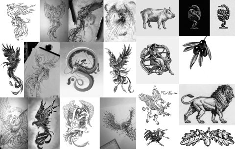
Fig. 1. Wiggett, 2022a. Phoenix and Illustration Style Reference Moodboard.
I explored the concept of a toolbox of elements that would combine to form different iterations of the logo to cater to various print and digital formats.
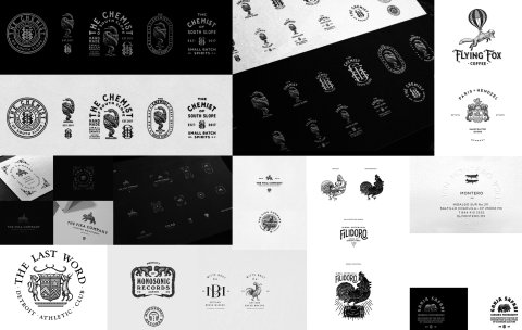
Fig. 2. Wiggett, 2022b. Logo and Logo Toolbox Reference Moodboard.
My initial sketch executions resulted in an identity that was too classical in nature and lacked the energy and bold personality of the brand. I, therefore, created a moodboard of bold, vibrant colour and typography executions to strengthen the positioning of the logo.
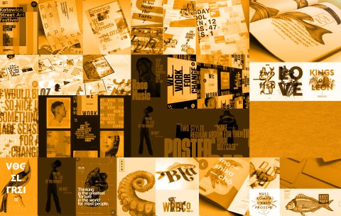
Fig. 3. Wiggett, 2022c. Ginger Storm Logo and Personality Reference Moodboard.
I felt the most crucial aspect of the logo was the 'girl riding a phoenix' icon/ illustration. This etching would be a graphic element in all brand design and illustrate my craft and skill to clients. I executed various iterations of the phoenix with subtle tweaks and changes made along the way. Once I was happy with the outcome, I did a final structured drawing which I then used to create the etching in pen and later traced in illustrator.
Input from fellow classmates, industry peers and experts was received and directed this process from inception.
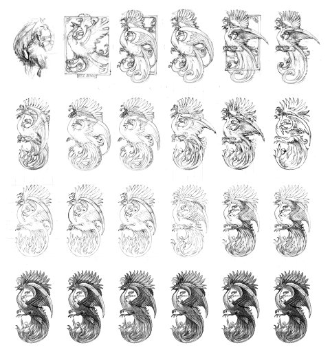
Fig. 4. Wiggett, 2022d. Ginger Storm Icon/ Illustration Development Including Conceptual Sketches, Iterations, Corrections, Final Shape Outlines and Final Sketches in Different Etching Styles.
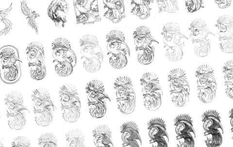
Fig. 5. Wiggett, 2022e. A Detailed Look at the Subtle Revisions Throughout the Developmental Process.
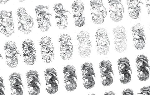
Fig. 6. Wiggett, 2022f. A Further look at the Etching Development from Inception.
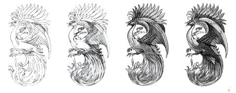
Fig. 7. Wiggett, 2022g. Ginger Storm Icon/ Illustration Final Shape Outlines and Two Final Sketches in Different Etching Styles.
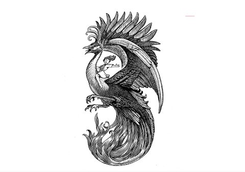
Fig. 8. Wiggett, 2022h. The Final Pen Etching of the Ginger Storm Icon.
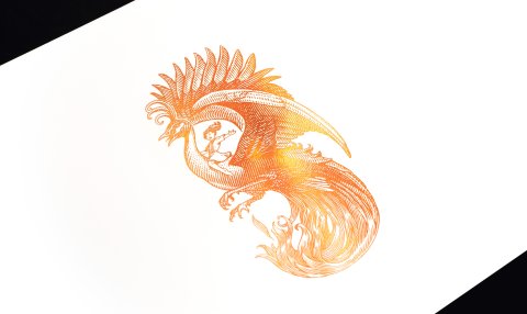
Once the etching was finalised, I drew a vector version in illustrator and sent it off to the printers for foiling. I felt a vibrant orange foil would give the impression of fire and energy which tied back into the Brand Positioning and Brand Name.
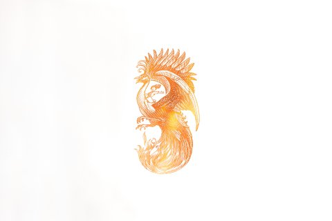
Fig. 9. Wiggett, 2022i. The Final Pen Etching of the Ginger Storm Icon.
List of Figures
Figure 1. Wiggett, S. (2022a). Phoenix and Illustration Style Reference Moodboard. [Image Archive] Storm’s Image Archive.
Figure 2. Wiggett, S. (2022b). Logo and Logo Toolbox Reference Moodboard. [Image Archive] Storm’s Image Archive.
Figure 3. Wiggett, S. (2022c). Ginger Storm Logo and Personality Reference Moodboard. [Image Archive] Storm’s Image Archive.
Figure 4. Wiggett, S. (2022d). Ginger Storm Icon/ Illustration Development Including Conceptual Sketches, Iterations, Corrections, Final Shape Outlines and Final Sketches in Different Etching Styles. [Image Archive] Storm’s Image Archive.
Figure 5. Wiggett, S. (2022e). A Detailed Look at the Subtle Revisions Throughout the Developmental Process. [Image Archive] Storm’s Image Archive.
Figure 6. Wiggett, S. (2022f). A Further look at the Etching Development from Inception. [Image Archive] Storm’s Image Archive.
Figure 7. Wiggett, S. (2022g). Ginger Storm Icon/ Illustration Final Shape Outlines and Two Final Sketches in Different Etching Styles. [Image Archive] Storm’s Image Archive.
Figure 8. Wiggett, S. (2022h). The Final Pen Etching of the Ginger Storm Icon. [Image Archive] Storm’s Image Archive.
Figure 9. Wiggett, S. (2022i). The Final Pen Etching of the Ginger Storm Icon. [Image Archive] Storm’s Image Archive.
Figure 10. Wiggett, S. (2022j). he Final Pen Etching of the Ginger Storm Icon. [Image Archive] Storm’s Image Archive.