TOOLBOX CONCEPT
The logo toolbox concept continued with various typographical executions. This stage of the logo development resulted in the most failures. My initial toolbox executions worked, but the classical style typography was not in line with the bold, vibrant personality of the brand. Peer review also commented that the direction was too reminiscent of alcohol brands.
I started exploring bolder typography options and drew a Black Letter-inspired font at this stage. This was discarded for overpowering the identity and not being contemporary.
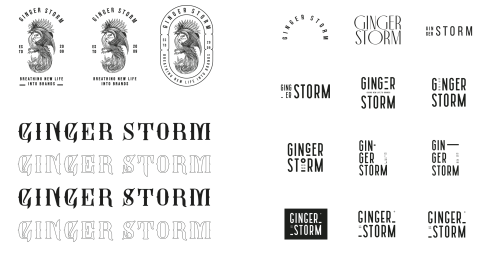
Fig. 1. Wiggett, 2022a. Initial Logo Development Including the Creation of a Ginger Storm Typeface and Other Type Executions.
Taller, elegant typography executed in a contemporary way was the only feasible solution that worked harmoniously with all design elements.
A 10-minute workshop exercise, where I executed many logo toolbox options in the allotted time, resulted in many promising options. These were further refined to the most visually appealing outcomes.
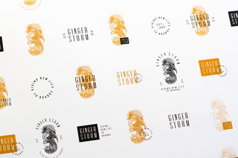
Fig. 2. Wiggett, 2022b. Logo Iterations Created from the Ginger Storm Toolbox.
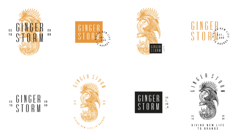
Fig. 3. Wiggett, 2022c. Final Logo Iterations Created from the Ginger Storm Toolbox.
I experimented with various print techniques to bring the logo to life. The printing included orange foiling and Scodex/ raised varnish printing. I also included contrasting logo design executions from the more contemporary, expected options to the oversized graphic options.
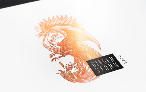
Fig. 4. Wiggett, 2022d. Photographed Ginger Storm Logo Option Printed with an Orange Foil.
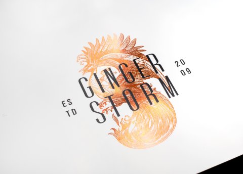
Fig. 5. Wiggett, 2022e. Photographed Ginger Storm Logo Option Printed with an Orange Foil.
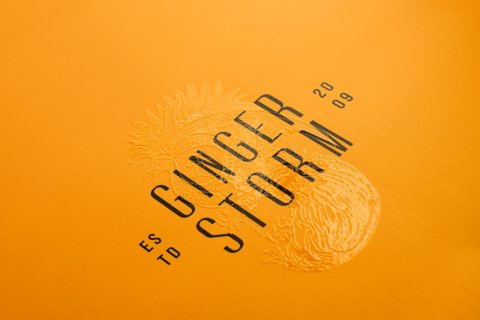
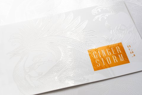
Fig. 7. Wiggett, 2022g. Photographed Ginger Storm Logo Option Printed with a Scodex Clear Varnish.
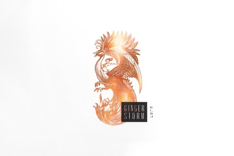
Fig. 8. Wiggett, 2022h. Photographed Ginger Storm Logo Option Printed with an Orange Foil.
CONCLUSION
Designing a logo for myself is exceedingly difficult. Nothing is perfect enough, and the self-imposed pressure is insurmountable, inhibiting the creative process.
The new logo and name change were met with positive humour and lauded for being “just the right amount of offbeat and quirky”. Furthermore, individuals responded to the intrigue and expressed admiration for the craft and creativity. The new branding is more aligned with the spirit of the business and forms the keystone of the new corporate identity.
List of Figures
Figure. 1. Wiggett, S. (2022a). Initial Logo Development Including the Creation of a Ginger Storm Typeface and Other Type Executions. [Image Archive] Storm’s Image Archive.
Figure. 2. Wiggett, S. (2022b). Logo Iterations Created from the Ginger Storm Toolbox. [Image Archive] Storm’s Image Archive.
Figure. 3. Wiggett, S. (2022c). Final Logo Iterations Created from the Ginger Storm Toolbox. [Image Archive] Storm’s Image Archive.
Figure. 4. Wiggett, S. (2022d). Photographed Ginger Storm Logo Option Printed with an Orange Foil. [Image Archive] Storm’s Image Archive.
Figure. 5. Wiggett, S. (2022e). Photographed Ginger Storm Logo Option Printed with an Orange Foil. [Image Archive] Storm’s Image Archive.
Figure. 6. Wiggett, S. (2022f). Photographed Ginger Storm Logo Option Printed with a Scodex Clear Varnish. [Image Archive] Storm’s Image Archive.
Figure. 7. Wiggett, S. (2022g). Photographed Ginger Storm Logo Option Printed with a Scodex Clear Varnish. [Image Archive] Storm’s Image Archive.
Figure. 8. Wiggett, S. (2022h). Photographed Ginger Storm Logo Option Printed with an Orange Foil. [Image Archive] Storm’s Image Archive.